Preview image. Unlock full-res
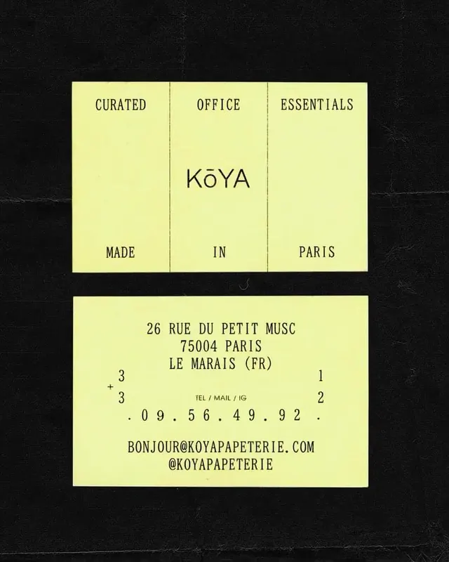
A business card and brand card system for Koya Papeterie using pale yellow cards with navy typography, a three-column grid layout, and Parisian address details.
Summary
A business card and brand card system for Koya Papeterie using pale yellow cards with navy typography, a three-column grid layout, and Parisian address details.
Visual description
Two pale yellow cards printed on a dark background show a cohesive stationery identity. The top card divides into three equal columns separated by thin navy rules: "Curated" (left), "Office" (center with Koya wordmark in smaller type), and "Essentials" (right), with "Made" (left), "In" (center), and "Paris" (right) below. The bottom card contains the full address (26 rue du Petit Musc, 75004 Paris) centered, with "+33 09.56.49.92" split left and right, and contact details (email, Instagram handle) below. All type is navy, all-caps, condensed sans-serif, with generous margins. The cream-pale-yellow card stock contrasts sharply against the black background.
Key takeaway
The three-column vertical grid creates elegant symmetry while organizing distinct information tiers. All-caps, uniform sans-serif type at generous size on a monochromatic cream field communicates quiet luxury. The thin navy dividing rules guide the eye without adding visual noise. Pale yellow is an underused stationery color that reads both warm and professional.
Reuse notes
Ideal for artisanal, creative, or luxury brands (design studios, galleries, boutique retailers, specialty foods). The pale-yellow-on-dark palette is striking in presentation but requires good card stock quality to feel premium. Works especially well for location-driven brands that want to emphasize place (Paris, a specific address) as part of identity.
More like this




Keep what you find
A free account saves references to boards and can send you a weekly email of picks based on what you save.
To see every result, go Pro.