Preview image. Unlock full-res
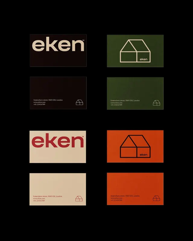
A real-estate brand identity across six stationery variations using a bold geometric house mark, minimal wordmark, and color riffs on warm and cool earth tones.
Summary
Eken's identity system shows how a single geometric house icon and sans-serif wordmark function across three color palettes (dark/cream, forest green, burnt orange) on business cards and stationery.
Visual description
Six rectangular cards in a three-by-two grid, each showcasing the same visual hierarchy on colored backgrounds. The cream and dark versions pair a large "eken" wordmark in a modern sans-serif with a minimalist line-drawn house icon below, plus contact details (street address, website, phone) in small type and the icon repeated bottom-right. The green variant inverts: pale green background with cream text and a outlined house icon. The burnt-orange cards repeat the same proportions and layout with dark text. The consistency across color riffs demonstrates system coherence; the warm earth-tone palette (olive, terracotta, cream, dark brown) grounds the mark as trustworthy and grounded.
Key takeaway
The color-system principle: one or two-color variants per palette, each with the same internal logic (logo top, contact block bottom-right, small icon anchoring corner), makes the identity feel purposeful rather than arbitrary. The wordmark-plus-icon combo (text + simple geometric shape) is economical and memorable.
Reuse notes
Strong for real-estate, property, or residential brands. The earth-tone palette reads as approachable and sustainable. The grid approach works well for printed collateral bundles (business cards, letterheads, envelopes) where showing multiple versions side-by-side builds confidence in the system.
More like this




Keep what you find
A free account saves references to boards and can send you a weekly email of picks based on what you save.
To see every result, go Pro.