Preview image. Unlock full-res
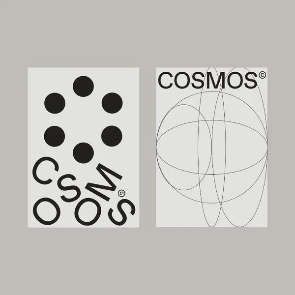
A two-panel monochrome logo guideline showing a constructed geometric mark (six circles arranged around a center) and a dynamic line-based symbol.
Summary
A two-panel monochrome logo guideline showing a constructed geometric mark (six circles arranged around a center) and a dynamic line-based symbol for COSMOS.
Visual description
Left panel: a grid-based construction of the wordmark "COSMOS" in stacked, broken letterforms created by overlapping black and white shapes, with six circles floating above forming a circle around empty space, suggesting motion or orbital mechanics. Right panel: the COSMOS trademark rendered as overlapping curved lines (ellipses) forming a sphere or globe shape, suggesting dimensionality and cosmic themes. Both marks use pure black on white, strict geometric forms, and visible construction guidelines (the left shows grid lines, corner circles, and measurement indicators). Registered trademark symbols appear on both variants. Gray background unifies both panels. No narrative text; the marks speak through clarity and precision.
Key takeaway
Using circles and orbital arrangements conveys science, technology, or cosmic themes without illustration or photorealism. Pairing a text-based and symbol-based version of the same mark (here, geometric wordplay and geometric abstraction) gives clients flexibility across use cases. Construction guidelines visible in the reference (grid, circles, dimensions) telegraphs that this is a system, not a one-off design, increasing perceived value.
Reuse notes
Excellent reference for tech, scientific, aerospace, or AI brands seeking sophistication and precision without warmth. The pure monochrome approach works across all media (embroidery, laser-cut, foil). Scale it tight if the orbital/satellite metaphor fits your space.
More like this




Keep what you find
A free account saves references to boards and can send you a weekly email of picks based on what you save.
To see every result, go Pro.