Preview image. Unlock full-res
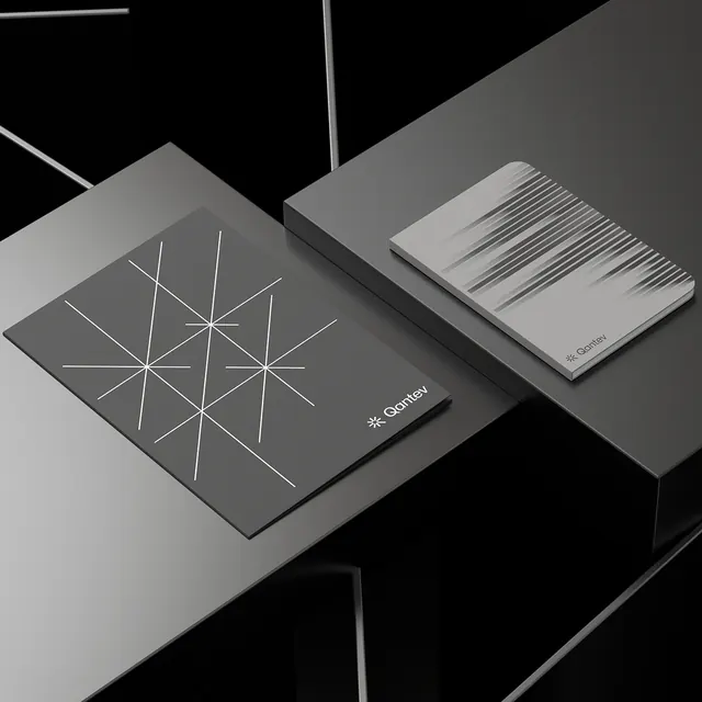
Black and white stationery set with geometric grid patterns and minimalist branding, showing refined typographic placement on matte surfaces.
Summary
A monochromatic stationery suite featuring overlapping business cards and a booklet, unified by a geometric triangular grid pattern and restrained type placement that signals precision and refined craftsmanship.
Visual description
Two stationery pieces arranged at an angle on a faceted black and white surface: a business card on the left printed with a nested-triangle grid occupying its upper half, and a booklet on the right with horizontal line texture. Both carry a small sans-serif logotype (three letters, likely lowercase, in gray). The composition uses sharp diagonal alignment and dramatic chiaroscuro, with each piece angled to catch light and cast soft shadows. The grid pattern is constructed from thin white lines forming a geometric lattice across a dark ground; the booklet shows parallel horizontal marks. Surfaces are matte and flat.
Key takeaway
The restraint of using a single geometric system (the triangular grid) as both the primary visual and a subtle structural element; the discipline of one-color minimal branding placed with precision; and the use of material finish (matte paper, angled lighting) to convey luxury rather than relying on color.
Reuse notes
Excellent reference for minimal tech, fintech, or B2B branding where precision and craftsmanship matter. Works best when the geometric pattern can be a real system (not decoration) and the logo is small and sans-serif. The monochrome approach requires confident photography and material choices to avoid flatness.
More like this







Keep what you find
A free account saves references to boards and can send you a weekly email of picks based on what you save.
To see every result, go Pro.