Preview image. Unlock full-res
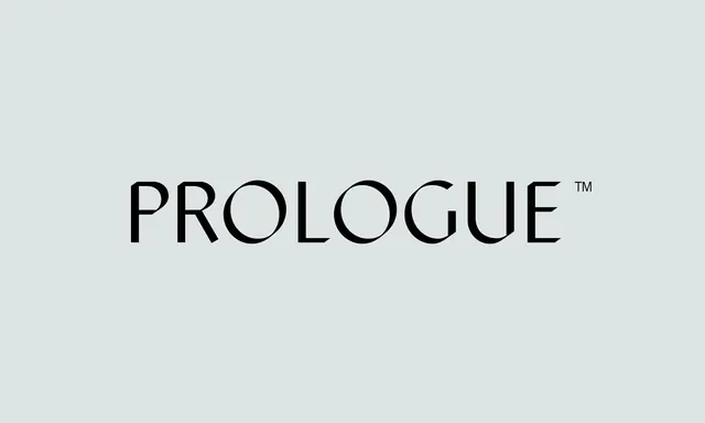
Geometric sans-serif wordmark with uniform stroke weight and subtle curvature in rounded letterforms against a soft gray background.
Summary
A geometric sans-serif wordmark with consistent stroke weight and gently rounded corners, centered on a neutral gray ground. The TM mark is positioned at upper right.
Visual description
Centered wordmark reading "PROLOGUE" in a geometric sans-serif face with uniform stroke weight throughout all letterforms. The rounded counters (visible in O and P) create a soft, approachable quality despite the technical geometry. Small TM superscript sits at the upper right. The composition is simple and symmetrical against a pale blue-gray background, with substantial white space framing the mark on all sides. No additional texture or ornamentation.
Key takeaway
The pairing of geometric rigor with subtle rounding for warmth. The consistent stroke weight across all characters (including curves) maintains visual stability and legibility at any scale. The restraint of white space around a centered mark as a confidence signal.
Reuse notes
Excellent reference for corporate identity or tech-adjacent brands needing both authority and friendliness. Works well at small sizes due to the open, generous letterforms. The monochrome treatment makes it adaptable across any background palette.
More like this







Keep what you find
A free account saves references to boards and can send you a weekly email of picks based on what you save.
To see every result, go Pro.