Preview image. Unlock full-res
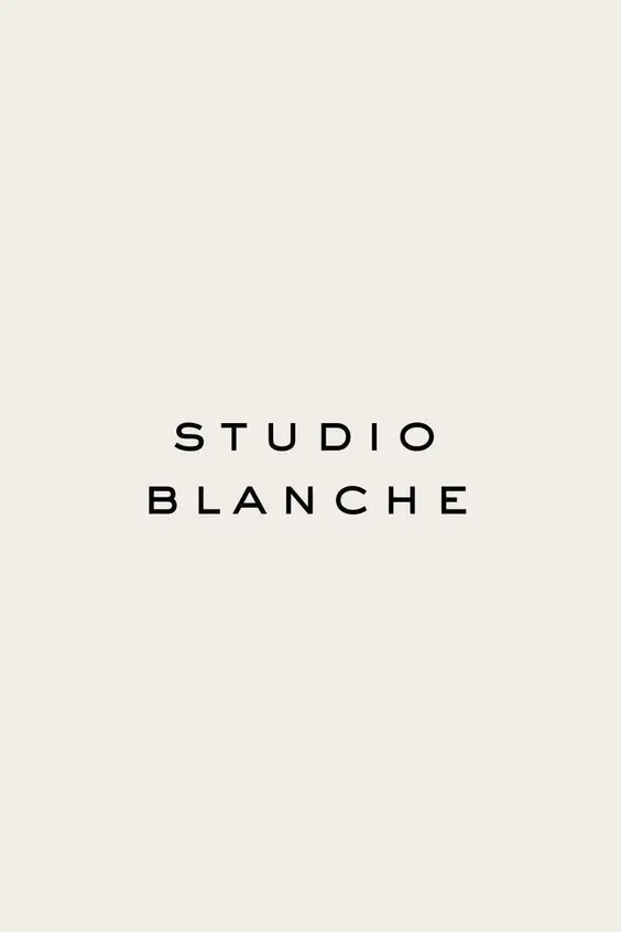
Centered two-line wordmark in evenly spaced all-caps sans-serif over a light beige ground.
Summary
Centered two-line wordmark in evenly spaced all-caps sans-serif over a light beige ground.
Visual description
"STUDIO BLANCHE" in two lines, rendered in a geometric sans-serif with generous letter-spacing. The typeface is modern, uniform in weight, and set in all capitals. The text occupies the optical center of a large field of off-white, almost cream-colored space, with equal breathing room above and below. The contrast between the dark gray letterforms and the pale background is subtle but clear.
Key takeaway
The discipline of extreme negative space as the primary design move. The tracking (letter spacing) is the only visual embellishment, making every character equally weighted and readable. This approach scales across any substrate and remains legible at any size.
Reuse notes
Strong foundation for a luxury, editorial, or design-focused brand. Works best with a refined sans-serif in a narrow or regular weight. The lightness of the background is essential to the elegance; darker grounds flatten the effect.
More like this




Keep what you find
A free account saves references to boards and can send you a weekly email of picks based on what you save.
To see every result, go Pro.