Preview image. Unlock full-res
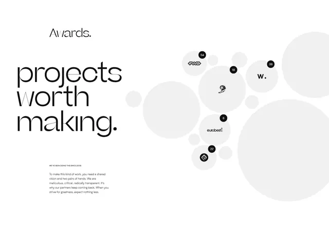
Awards studio branding slide with oversized headline, scattered client logos in soft circles, and body copy on a minimalist light background.
Summary
A creative studio's branding system presentation showing the logo, headline, scattered client work badges, and mission statement on a clean, monochromatic layout.
Visual description
Left-aligned headline "projects worth making" in large, minimalist sans-serif over light gray-white background. Right side features organic, asymmetrically arranged circles of varying sizes in pale gray and off-white, each containing a client logo (FWS, W., Eurobest, and others) and numbers. Below the headline, a short paragraph in small sans-serif copy describes the studio's ethos: "To make this kind of work, you need a shared vision and two pairs of hands. We are meticulous, critical, radically transparent. It's why our partners keep coming back..." The entire composition relies on abundant negative space, rhythm of circle placement, and a restrained gray-white-black palette.
Key takeaway
The organic circle treatment for displaying client logos; soft accent color and size variation make a logo wall feel less rigid than a grid. The paired headline-and-manifesto layout (bold statement above, values copy below) is a strong pattern for studio identity. Minimal use of stroke detail on the small circles keeps focus on the names.
Reuse notes
Strong for creative agency, design studio, or consulting brand decks. Works best when the client roster is visually diverse enough to create visual rhythm within circles. Pair with editorial or portfolio work that speaks to the manifesto. Light background essential for this circle treatment.
More like this



Keep what you find
A free account saves references to boards and can send you a weekly email of picks based on what you save.
To see every result, go Pro.