Preview image. Unlock full-res
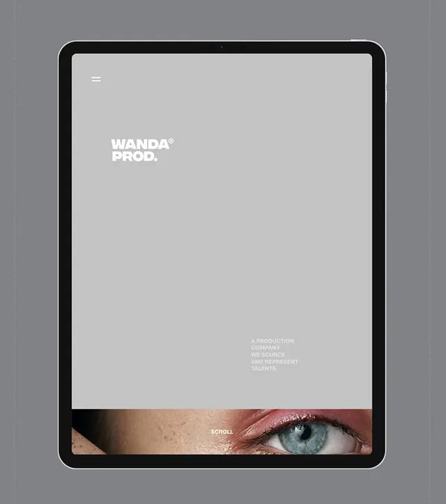
The 'Wanda Prod' wordmark displayed on a tablet mockup with minimalist layout and a portrait detail breaking into the lower frame.
Summary
The 'Wanda Prod' wordmark and tagline are centered on a tablet mockup's light gray field, with a cropped eye photograph visible at the bottom.
Visual description
A tablet device mockup in black with rounded corners against a neutral gray background. The screen displays a light gray field with white and dark gray text. Near the top center sits the 'Wanda Prod' wordmark in bold, clean sans-serif capitals, followed below by the registered trademark symbol. Small gray text at bottom reads "A production company we source and represent talents". The lower quarter of the screen shows a tight crop of a human eye with blue iris, breaking the geometric minimalism with an intimate, personal detail. The eye portion suggests vertical scrolling or a reveal interaction. Overall composition uses centered vertical hierarchy and significant white space, emphasizing typography and the subtle human element.
Key takeaway
The contrast between abstract minimal wordmark and a literal, cropped human image creates intrigue and positions the company as people-focused. The device mockup context demonstrates how the brand functions in digital application. Using a single design element (an eye) to suggest the subject matter (representing talent) is economical and memorable.
Reuse notes
Effective for talent agencies, creative studios, or production companies emphasizing human relationships and curation. The tablet mockup is suitable for portfolio presentations or case studies. The palette is corporate without feeling cold; the eye detail adds warmth and specificity. Works well for recruitment or agency positioning that needs to feel both professional and approachable.