Preview image. Unlock full-res
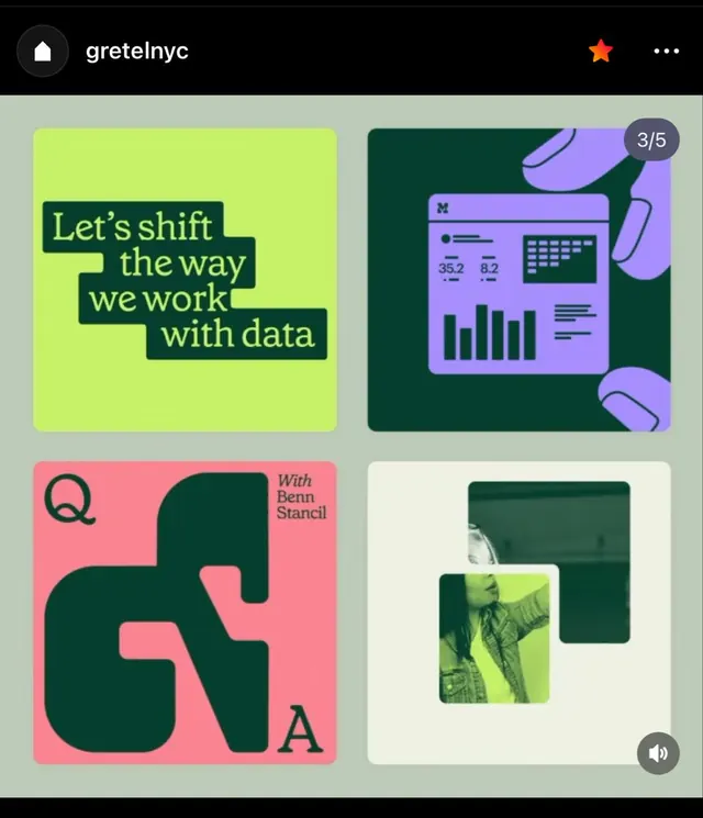
Gretel NYC's cohesive brand system combining vibrant lime, dark green, coral pink, and purple across modular UI cards, logo cutouts, and product interface mockups.
Summary
Gretel NYC's vibrant, modular brand system pairing lime-green and dark-green typography on a muted background with coordinated UI cards showing dashboards, analytics mockups, and photography samples.
Visual description
A four-card layout on muted gray-green background. Top-left: bright lime-green rounded square with dark-green stenciled headline "Let's shift the way we work with data" in serif display type. Top-right: dark teal card with purple UI mockup showing metric cards, data table, and bar chart in purple and dark-green accents, numbered "3/5" (carousel position). Bottom-left: coral-pink rounded square with dark-green cutout letter forms spelling "QA", flanked by italic text "With Benn Stencil". Bottom-right: off-white card with nested dark-green and lime-green photo frames containing landscape photography. Header shows Instagram profile "gretelnyc" with white icon logo and star/menu controls.
Key takeaway
The bold, complementary color combination (lime-green and dark-green with accent coral-pink) creates personality without chaos. The modular card layout is self-contained and reusable across materials. Stencil-cut letterforms pair playfully with structured UI mockups, balancing approachable and technical.
Reuse notes
Strong for SaaS, analytics, or creative agency brands targeting tech-forward audiences. The color scheme holds its own whether displayed at small or large scale. Modular format works for portfolio showcases, product feature cards, or brand guidelines. Use when visual energy and modern simplicity must coexist.