Preview image. Unlock full-res
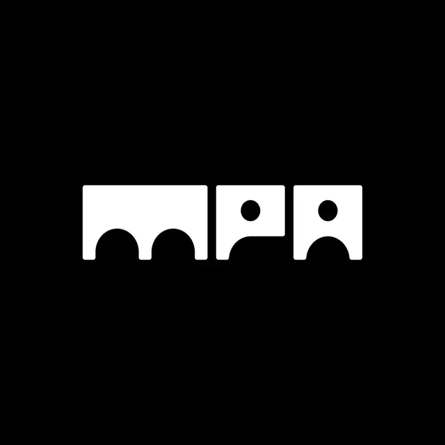
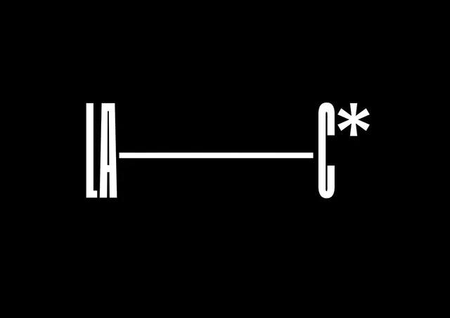
Monoline logo connecting two letterforms via a clean horizontal bar on a black field, using precise geometric line weight to unify the mark.
Summary
Monoline letterform logo combining curved strokes and a connecting horizontal bar into a unified mark against pure black, demonstrating extreme constraint and technical precision.
Visual description
Two stylized letterforms rendered in white monoline strokes against a black background. The left form shows rounded vertical elements suggestive of "LA," while the right form curves upward with a secondary mark resembling a spark or accent. A single horizontal bar bridges both forms at mid-height, creating visual continuity. Every stroke maintains identical weight throughout. Composition is perfectly centered and balanced, with ample negative black space surrounding the mark.
Key takeaway
The use of a single connecting line to unify disparate letterforms into one coherent mark. The monoline constraint that forces every element to compete equally, making anatomy and spacing the only variables. The restraint to use only white and black, letting geometric purity carry all meaning.
Reuse notes
Strong reference for minimal identity systems, tech brands, or any application needing stark, timeless marks. Works well at small scale and in single-color contexts. The monoline approach scales from favicon to billboard without weight adjustment.