Preview image. Unlock full-res
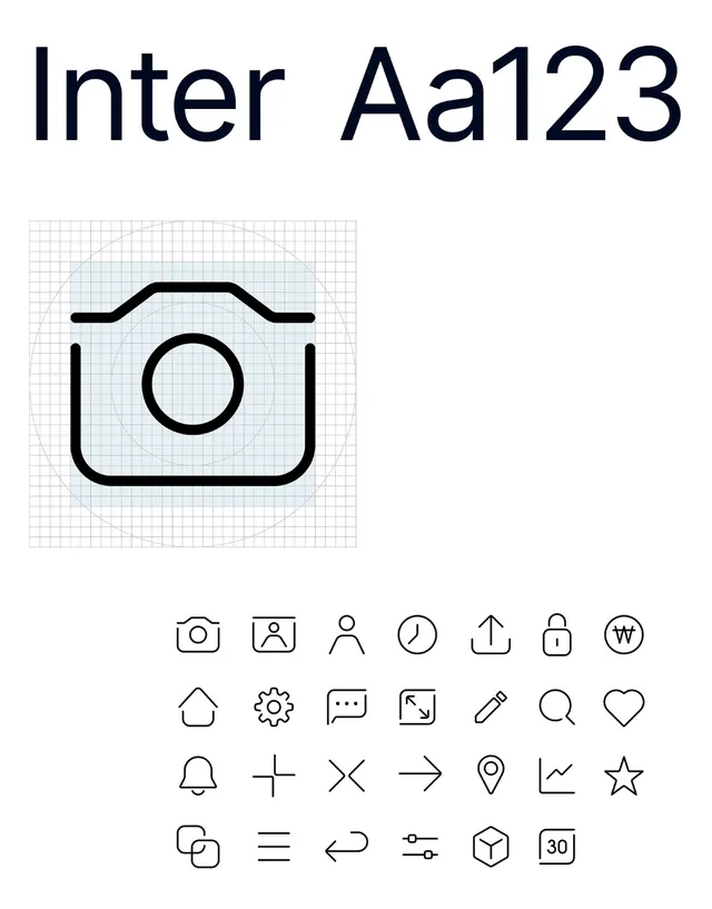
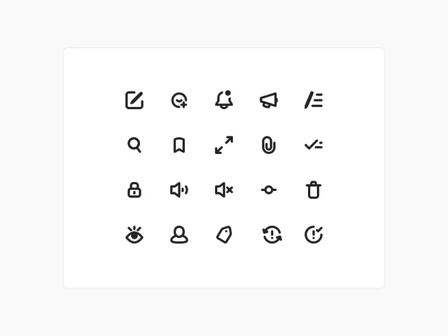
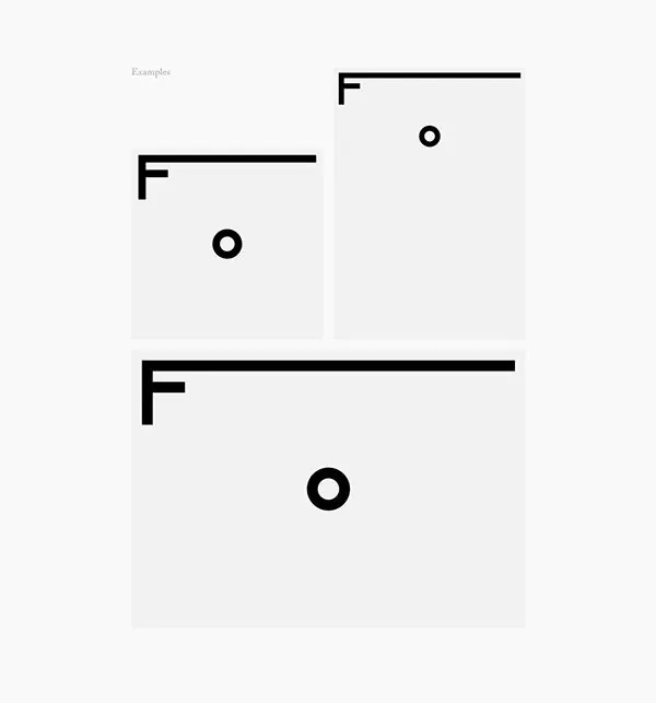
Three abstract geometric icons using bold strokes and circles, demonstrating a modular, high-contrast iconography system.
Summary
Three variations of an abstract mark built from thick straight lines and a circle, demonstrating a scalable, geometric icon language suitable for product UI or brand systems.
Visual description
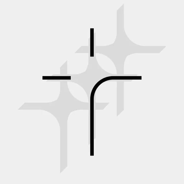
Three stacked icon examples, labeled "Examples." Each icon pair consists of a thick black vertical or horizontal stroke with a circle accent. The top and middle marks are roughly square; the bottom stretches wider. All use the same stark black lines on a light gray-white ground. The compositions are asymmetric—line and circle float rather than align to a grid—creating visual tension within the geometric constraint. Spacing between the three examples establishes rhythm and suggests a larger icon family.
Key takeaway
A stroke-and-circle vocabulary that works at any scale. The asymmetric placement makes each mark feel custom-drawn despite the simple geometry, avoiding generic icon-set coldness. The high-contrast black-on-white ensures legibility at small sizes.
Reuse notes
Strong template for building UI icon systems or brand mark families. Works well for tech, developer tools, or editorial contexts. The hand-drawn quality of the placement suggests playfulness despite the stark style, suiting brands that need geometry without sterility. Pair with geometric sans-serif type for cohesion.