Preview image. Unlock full-res
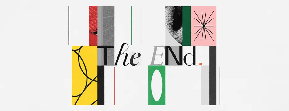
A horizontal typographic specimen using 'The End' set in sans-serif across a grid of fragmented color blocks, textures, and negative space.
Summary
A horizontal typographic specimen using 'The End' set in sans-serif across a grid of fragmented color blocks, textures, and negative space.
Visual description
The words "The End" are split and distributed across a modular grid of rectangular color blocks and textured panels. A bright yellow panel contains an organic hand-drawn line. Red, gray, pink, and green blocks are interspersed with clean white space and thin vertical dividers. The serif 'T' from 'The' sits in a red/gray block at left; the 'E' and 'N' are letterpress-style or heavily weighted sans-serif scattered across green and white fields. A delicate pink square with radiating lines sits upper right. The overall arrangement feels like a carefully deconstructed poster or gallery system where letterforms are architectural elements in their own right. The composition reads left-to-right with deliberate pauses and breathing room.
Key takeaway
The modular grid system that breaks type into spatial components rather than reading as a single line. The use of varied textures and hand-drawn elements within geometric blocks creating sophistication and personality. The strategic use of full white fields as equal visual weight to colored blocks.
Reuse notes
Excellent reference for editorial design, gallery catalogs, contemporary posters, and branding systems that favor structural rigor and conceptual boldness. The architectural fragmentation suits print at display sizes (16x20 inches and up) and benefits from premium printing techniques (letterpress, textured stocks). Works for design-forward, intellectual contexts; too austere for consumer-friendly branding.
More like this



Keep what you find
A free account saves references to boards and can send you a weekly email of picks based on what you save.
To see every result, go Pro.