Preview image. Unlock full-res
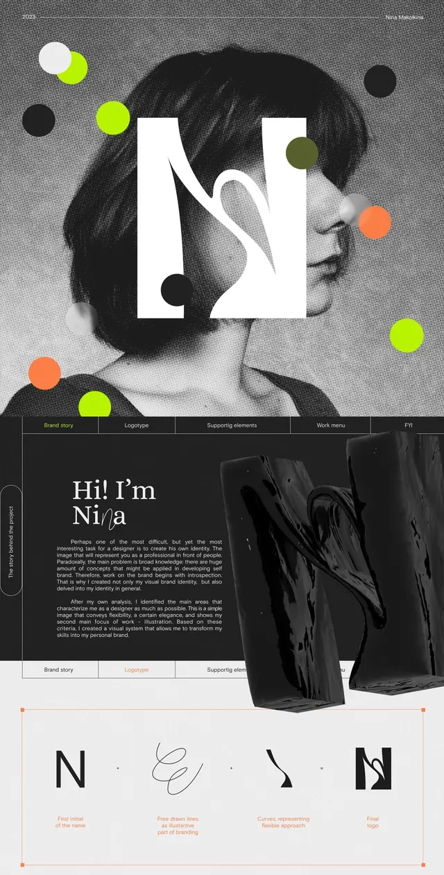
A personal identity system using a cut-out typographic letterform 'N' over a grayscale portrait, accented with neon circles, layered with supporting pages and a type specimen showing organic, gesture-based letter variations.
Summary
A personal identity system for "Ni/a" that combines a large cut-out sans-serif letterform overlaid on a grayscale portrait with scattered neon-colored circles, supported by multiple pages showing brand philosophy, type specimen, and logo variations.
Visual description
The cover sheet shows a white sans-serif "N" cut out from the page, revealing a black-and-white photographic profile underneath. Orbiting the letter are 5-6 colored circles in lime green, orange, soft yellow, and charcoal, creating dynamic asymmetrical balance. The lower portion displays a grid of images on a dark background with navigation tabs, followed by a centered "Hi! I'm Ni/a" headline in stacked sans-serif over body copy. A final page shows four interpretations of the lettermark: the original sharp "N", a sketchy handwritten "e", a curved organic form, and a final geometric logo, each labeled with its function in the visual system. The entire palette is anchored in grayscale with precise pops of neon.
Key takeaway
The use of geometric negative space to integrate type with a portrait. The controlled neon accent palette creating energy without chaos. The systematic approach to showing both rigid and organic letterform variations as part of one cohesive brand.
Reuse notes
Strong for portfolio sites, personal brands, and creative agencies wanting to show design philosophy. The handdrawn variant offers softness that the geometric core lacks. Works best when you have an interesting portrait image to cut through. The type-specimen approach is ideal for self-promotion or getting design jobs.
More like this









Keep what you find
A free account saves references to boards and can send you a weekly email of picks based on what you save.
To see every result, go Pro.