Preview image. Unlock full-res
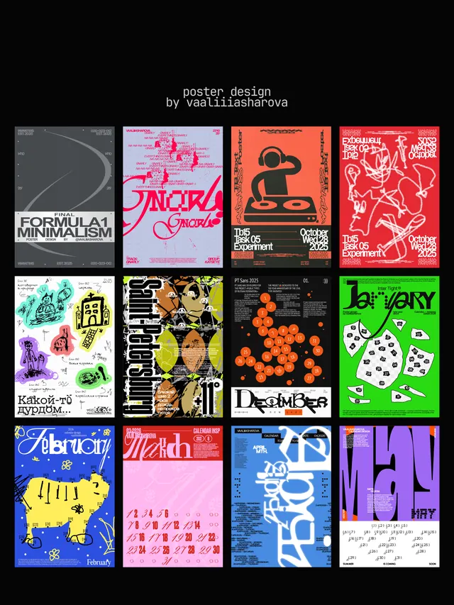
A 4x4 grid of distinctly styled event and cultural posters demonstrating typographic, illustrative, and abstract approaches across varied color palettes.
Summary
A diverse curated collection of sixteen event/cultural posters arranged in a grid, each exploring distinct visual language from minimal type to bold illustration to abstract pattern.
Visual description
A 4x4 grid of square poster compositions on a black background. Each poster occupies its own cell and demonstrates a distinct approach: upper-left shows minimal gray line-work curves; second shows hot pink and purple glitch-style typography; third features black silhouettes of objects on orange; fourth displays white line illustration of animals on bright red. Middle rows continue the variety: teal-and-white organic shapes, yellow and black geometric composition, orange dots on black with word-art typography, bright green backgrounds with white geometric patterns, blue palette with yellow accents and geometric forms, pale pink with red typography, blue with white graphic elements, and purple/pink with hand-drawn marks. All compositions fill their cells completely, using display typography, illustrative mark-making, or pure geometric abstraction as focal points. Color palettes shift dramatically between adjacent posters.
Key takeaway
The variety of typographic treatments within a single conceptual framework (event poster) shows how distinct a brand can feel through style and color alone. The grid format allows direct comparison of different solutions to the same design problem. The raw, unconventional mark-making in several pieces (glitch effects, hand-drawn overlays, distorted type) demonstrates how imperfection can enhance visual impact for cultural events.
Reuse notes
Use as a reference library for event/cultural poster direction-setting; each poster offers a different temperament from energetic and maximalist to minimal and restrained. Particularly strong for music, art exhibition, or underground cultural event marketing. Many designs blur the line between graphic design and fine art, making them especially useful for brands seeking personality and distinction over corporate polish.
More like this




Keep what you find
A free account saves references to boards and can send you a weekly email of picks based on what you save.
To see every result, go Pro.