Preview image. Unlock full-res
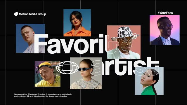
Dark-mode agency portfolio spread with bold white display type overlaid across a grid of colorful, individually framed portrait photos on a black background.
Summary
A dark-background agency portfolio with large, bold white display typography ("Favorable Fruits") overlaid across a grid of eight diverse, color-framed portrait photos.
Visual description
Against a solid black background and fine white grid, nine portrait frames are arranged in an asymmetric grid pattern. Each frame has a distinct color background: muted blue, bright orange, warm coral, soft pink-magenta, and neutral tones. The subjects are diverse professionals and personalities in contemporary styling. Bold sans-serif display type in white dominates the center of the composition, reading "Favorable Fruits" with smaller text. The top-left shows "Motion Media Group" as the agency name in smaller sans-serif. The bottom-left includes a descriptive tagline: "We create After Effects and Premiere Pro templates and specialize in motion design, 2D and 3D animation, flat design, and UI design". A hashtag "#YourFesb" appears in the top-right. The white grid lines segment the entire layout into modules, creating a structured yet dynamic composition.
Key takeaway
The contrast of a black background with colorful, individually framed images; the way bold, white display type can overlap and hold legibility against diverse colored frames; the use of fine white grid lines as both structure and visual texture; asymmetric arrangement of frames that feels balanced and intentional.
Reuse notes
Ideal for creative agencies, design studios, and motion-graphics portfolios. The color-blocking strategy works well when you have diverse team members or project examples to showcase. The dark background makes vibrant colors pop and photographs feel premium. Works best at large scale (desktop landing pages, social media hero images). The dense composition and overlapping type demand careful font selection and weight contrast to remain readable.
More like this




Keep what you find
A free account saves references to boards and can send you a weekly email of picks based on what you save.
To see every result, go Pro.