Preview image. Unlock full-res
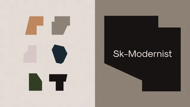
Two-panel identity layout pairing a set of six abstract earth-toned shapes with a dark angular block holding the Sk-Modernist wordmark in white.
Summary
A split brand-board frame: the left half catalogs six irregular flat shapes in muted earth tones, the right half shows the Sk-Modernist wordmark cut into a large dark angular block.
Visual description
The canvas is divided into two vertical panels. The left panel sits on a warm off-white ground and lays out six small abstract shapes in a loose 3x2 grid: a terracotta facet, a taupe block, a soft pink form, a near-black inkblot, a dark olive piece, and a black T-like glyph. Each is flat-filled with no outline or gradient. The right panel is a muted taupe field carrying a single large dark brown-black shape with stepped, notched corners; the word Sk-Modernist runs across it in clean white sans-serif. The restrained earthy palette and the absence of any photography or texture keep it reading as a system, not a poster.
Key takeaway
Presenting the supporting brand shapes as a tidy specimen grid next to the primary mark shows the identity's visual vocabulary at a glance. The notched container block doubles as both a backdrop and a brand shape, so the logo lockup is built from the same geometry as the supporting set.
Reuse notes
A good model for a brand-guidelines cover or a portfolio case-study opener where you want to summarize a whole system in one frame. The muted earth palette signals craft and restraint; swap in brand colors and it works for studios, foundries, or premium B2B. Needs a genuinely distinctive shape language to carry the left grid.
More like this






Keep what you find
A free account saves references to boards and can send you a weekly email of picks based on what you save.
To see every result, go Pro.