Preview image. Unlock full-res
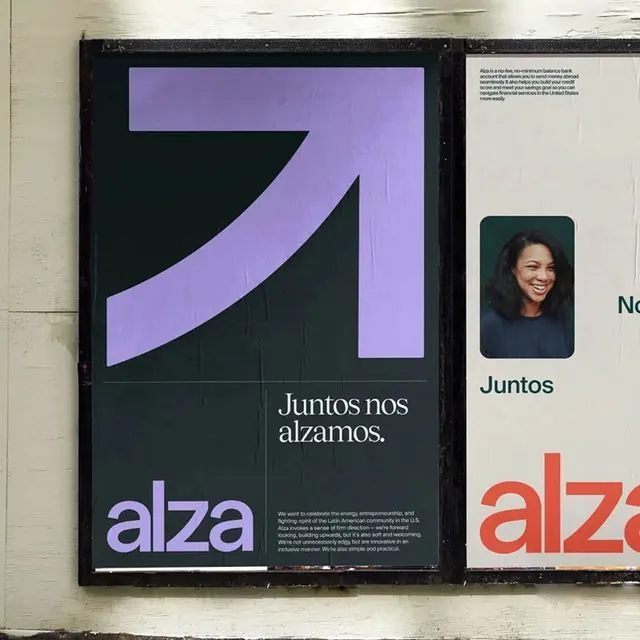
Nonprofit brand identity centered on a curved arrow swoosh in lavender gradient, set against dark charcoal with layered typography.
Summary
Nonprofit brand identity using a curved arrow in soft lavender gradient as its primary mark, paired with sans-serif text on dark charcoal, suggesting forward motion and institutional purpose.
Visual description
A framed poster showing the alza nonprofit mark: a thick curved swoosh flowing from lower left to upper right, rendered in a cool lavender-to-purple gradient. The mark sits atop a dark charcoal background. Below it, clean white sans-serif text reading "Juntos nos alzamos" (We rise together). The word "alza" appears separately in lavender lowercase type. A secondary brand variation visible on the right features a portrait photograph paired with institutional text and an accent mark in coral red. The composition balances geometric abstraction with readable, purposeful typography.
Key takeaway
The curve-and-gradient mark is economical yet directional, working at multiple sizes. The monochromatic dark background makes the gradient pop without competing colors. The single accent color (coral) on secondary materials creates a coherent extended palette.
Reuse notes
Strong for nonprofits and social-impact organizations seeking a progressive, forward-facing mark. The curved arrow reads as growth or movement, suitable for education, community, or advancement verticals. Works best with institutional typography and minimal, dark-toned layouts.