Preview image. Unlock full-res
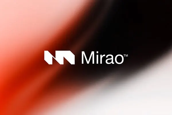
A minimalist logo for 'Mirao' featuring an angular, abstract white geometric mark set against a diagonal gradient transitioning from warm coral and peachy tones to deep brown-black.
Summary
The "Mirao" logo pairs an angular white geometric mark (two overlapping chevron-like shapes) with clean sans-serif wordmark set against a dynamic diagonal gradient background moving from warm peachy coral to deep charcoal black.
Visual description
A horizontal composition centered on the logo. The abstract mark occupies the left side: two interlocking white angular shapes suggesting forward motion or chevrons. The wordmark "Mirao™" in clean sans-serif sits right-justified in white. The background is a diagonal gradient at roughly 45 degrees, beginning with warm peach and coral tones in the upper left and descending through warm reds and browns to charcoal black in the lower right, creating visual depth and energy. The gradient is smooth and adds sophistication without overwhelming the crisp mark.
Key takeaway
The gradient direction (diagonal, upper-left to lower-right) supports the geometric mark's implied directionality and gives a tech-forward energy. High contrast between the white mark and dark-end gradient ensures legibility across applications. The angular mark is simple enough to scale down (favicon, favicon favicon) without losing recognition.
Reuse notes
Strong for SaaS, fintech, or developer-tool brands seeking modern minimalism with personality. The gradient works best at sizes where the detail reads clearly. Less suited to contexts requiring neutral, corporate visual stability; the gradient implies dynamism and disruption.