Preview image. Unlock full-res
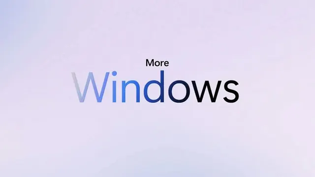
The Windows wordmark rendered in variable-weight sans-serif over a pale lavender-to-blue gradient background.
Summary
A minimalist type specimen displaying a sans-serif wordmark in mixed case (Windows) with a subtle two-step gradient floor from pale lavender to muted indigo-blue.
Visual description
Centered composition on a soft gradient background that shifts vertically from pale lavender-pink at top to dusty blue-grey below. The wordmark "Windows" is set in a modern sans-serif with mixed weight: "Windows" in light, then "More" in smaller dark-blue sans-serif above. Significant negative space on all sides emphasizes the type. The gradient is smooth and non-directional, reading more as a soft atmospheric blur than a hard transition.
Key takeaway
The restraint: only two colors in the background, neither saturated, creating a serene, open feeling that lets the typography shine. The small secondary "More" text adds hierarchy without competing. This approach works for tech products, SaaS platforms, and professional services where calm and trust matter more than visual drama.
Reuse notes
Ideal for software, operating system, or corporate identity systems that need to feel accessible and modern. The pale gradient works best on light-themed interfaces or printed materials with good white-space. Pair with clean, modern sans-serif across the system. Avoid on dark backgrounds or when contrast needs to be aggressive.
More like this




Keep what you find
A free account saves references to boards and can send you a weekly email of picks based on what you save.
To see every result, go Pro.