Preview image. Unlock full-res
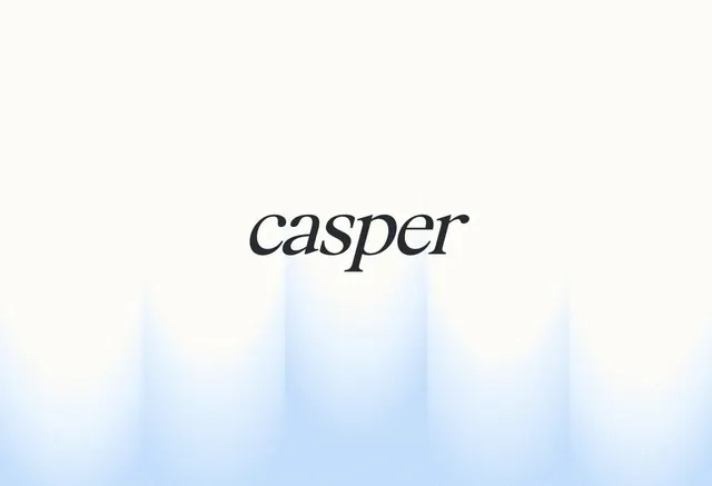
Serif wordmark 'casper' set against a soft white-to-light-blue vertical gradient, anchored by minimalist typography on a calm, neutral background.
Summary
A restrained serif wordmark 'casper' presented centered on a soft vertical gradient, using color contrast to anchor sophisticated typography without embellishment.
Visual description
The word 'casper' is rendered in a classic serif typeface, dark and neutral in color, positioned dead-center on the composition. The background is a gentle white-to-light-blue gradient running vertically, creating subtle depth and soft visual movement. The gradient is lightest at the top and progressively warmer/bluer toward the bottom. Ample negative space on all sides reinforces the minimalist approach and ensures the serif wordmark becomes the sole focal point. The overall proportion and placement emphasize breathing room over visual noise.
Key takeaway
Serif typefaces paired with soft directional gradients feel both classic and contemporary. The vertical gradient does the visual heavy lifting without competing with the type. A centered, isolated wordmark on this scale communicates restraint and premium identity.
Reuse notes
Effective for luxury, professional, or editorial branding where simplicity signals quality. Works well for high-end retail, beauty, or lifestyle identities. The serif choice adds warmth and tradition; the gradient ensures the layout does not feel sterile or static.
More like this






Keep what you find
A free account saves references to boards and can send you a weekly email of picks based on what you save.
To see every result, go Pro.