Preview image. Unlock full-res
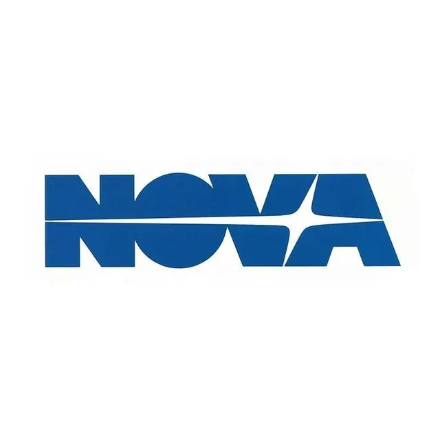
A bold sans-serif wordmark for NOVA with geometric negative-space cutouts creating a split, interlocking visual rhythm across the letterforms.
Summary
A bold sans-serif wordmark split horizontally by a rule line that divides each letter into upper and lower sections with geometric cutouts, creating an interlocking, dynamic composition.
Visual description
The wordmark NOVA is rendered in a heavy, condensed sans-serif in deep blue (#0F5094) against a white ground. A horizontal rule line bisects the entire word at mid-height. The letters are cut with angular, geometric negative spaces: the O contains a full circle of white; the V has a triangular cutout; the remaining letters are similarly carved. The upper and lower halves maintain slight visual separation through the rule, yet the letterforms' geometry ties them together. The effect is modern, architectural, and tension-filled.
Key takeaway
The horizontal rule as both structural divider and unifying device, preventing the design from fragmenting despite the aggressive negative-space cutting. The use of a single geometric cut shape per letter (circle, triangle, angles) maintains consistency while varying rhythm. The deep blue and full-bleed white pairing maximizes contrast and legibility despite the cutouts.
Reuse notes
Strong for tech, software, or futuristic brands where innovation and precision are core attributes. The geometric cuts can feel cold without the right context, so pair with warm supporting typography or imagery if the brand includes friendliness. The single-color requirement keeps it economical for single-color applications (embroidery, stamps, single-ink printing).