Preview image. Unlock full-res
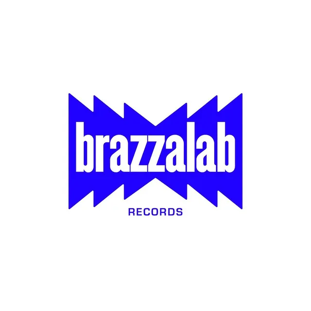
A royal-blue logo where white lowercase 'brazzalab' lettering is carved out of a jagged zigzag-edged blue block, with small 'RECORDS' caps below, set on white.
Summary
A logo for Brazzalab Records that knocks the white wordmark out of a solid royal-blue block whose top and bottom edges are cut into sharp zigzag teeth. The defining move is the jagged blue silhouette reading as a sound-wave or speaker-cone outline.
Visual description
Centered on white, a solid royal-blue rectangular mass has its upper and lower edges sliced into alternating triangular zigzag points, like a torn or vibrating band. The brand name "brazzalab" is reversed out in white as condensed, tightly packed lowercase letters that fill the block edge to edge. Beneath the block, the word "RECORDS" sits small and centered in matching blue uppercase. The whole mark is one flat saturated blue plus white negative space, no gradients or secondary color.
Key takeaway
The zigzag-cut container that turns a plain knockout wordmark into an audio-coded mark (sound wave, jagged amplitude) without any literal icon. Carving the name out of a shaped color block rather than setting type on top keeps the logo one solid silhouette that stays legible at small sizes and reverses cleanly.
Reuse notes
Built for a record label or anything music, audio, or events. The shaped-block-knockout approach suits a single saturated brand color and a short name. The zigzag reads as energy, so pair it with restrained supporting type. Test the jagged edges at small sizes to be sure the teeth do not muddy.