Preview image. Unlock full-res
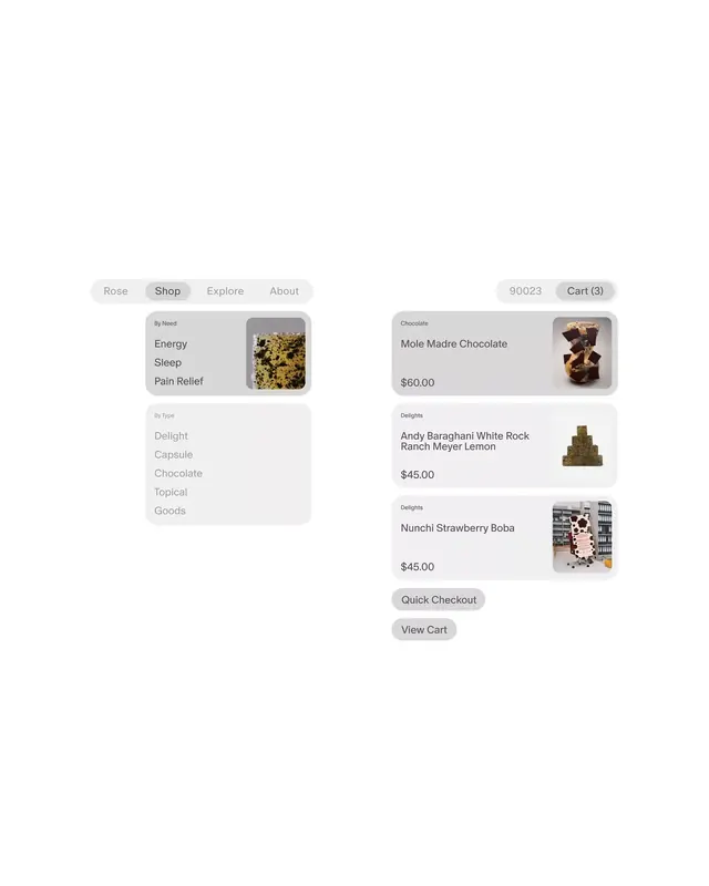
Light card-based layout for a supplement/wellness marketplace, organizing products by need category and type with muted tan, gray, and cream tones.
Summary
Light card-based layout for a supplement/wellness marketplace, organizing products by need category and type with muted tan, gray, and cream tones.
Visual description
Left sidebar displays filter tabs ("Rose" active, "Shop", "Explore", "About") and nested category lists: "By Need" (Energy, Sleep, Pain Relief) and "By Type" (Delight, Capsule, Chocolate, Topical, Goods). Right side shows a grid of product cards, each with a thumbnail image, product name, price, and muted secondary button. Three visible products: "Mole Madre Chocolate" ($60), "Andy Baraghani White Rock Ranch Meyer Lemon" ($45), "Nunchi Strawberry Boba" ($45). Bottom action buttons ("Quick Checkout", "View Cart") sit below. Header shows location badge "90023" and cart counter. Soft rounded corners on all cards; muted button colors (dusty rose, taupe, charcoal). Typography is clean sans-serif in mid-to-dark gray.
Key takeaway
Sidebar-plus-grid layout pattern for organized browsing; use of soft, muted color palette to convey wellness/natural products; minimal button treatment (understatement) rather than primary-CTA saturation; clear product information hierarchy (image > name > price > quick action).
Reuse notes
Ideal for health, wellness, or specialty food e-commerce. The muted palette works especially well for organic, supplement, or botanical brands. Card-per-product scales smoothly to 2-3 columns. The "By Need" category angle is particularly strong for health-focused shopping (differentiates from generic product listing). Assumes inventory is diverse enough to benefit from filtering.
More like this





Keep what you find
A free account saves references to boards and can send you a weekly email of picks based on what you save.
To see every result, go Pro.