Preview image. Unlock full-res
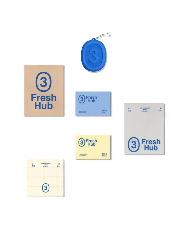
A Fresh Hub identity laid out across cards, tags, and notepads, built on a blue rounded-3 logo and bilingual type over earthy and pastel paper stocks.
Summary
A "Fresh Hub" brand identity shown as a flat-lay of collateral, all printed in one royal-blue ink. The system's anchor is a rounded numeral 3 drawn in a hand-outlined oval, repeated across every piece at different scales.
Visual description
Seven items float on a plain white surface in a loose grid: a kraft-brown card, several blue, pale-yellow, and grey cards and notepads, and one blue wax-seal-style hang tag embossed with the 3. The logo lockup pairs the outlined oval 3 with "Fresh Hub" in a bold, slightly rounded sans-serif. Smaller supporting copy runs bilingually, English ("Light Burden / More Vitality", "Light Burden More Vitality") alongside Chinese characters, sometimes split to the far corners of a card. Everything is printed in the same deep blue regardless of the paper color, so the kraft, butter-yellow, and grey stocks supply the only warmth and variation. One yellow sheet carries a faint printed grid.
Key takeaway
Locking a brand to a single ink color and letting the paper stock change while the ink stays constant, which keeps a multi-piece system unmistakably one family. Also the move of treating the numeral as the hero mark in a hand-drawn oval, then re-scaling that single element from tiny corner stamp to embossed hang-tag.
Reuse notes
A clean reference for a small food, grocery, or wellness brand building a stationery and packaging set on a tight budget, where one-color printing across mixed kraft and colored stocks is both cheaper and on-brand. The bilingual corner-set captions are a good pattern for any brand needing two scripts without clutter.
More like this


Keep what you find
A free account saves references to boards and can send you a weekly email of picks based on what you save.
To see every result, go Pro.