Preview image. Unlock full-res
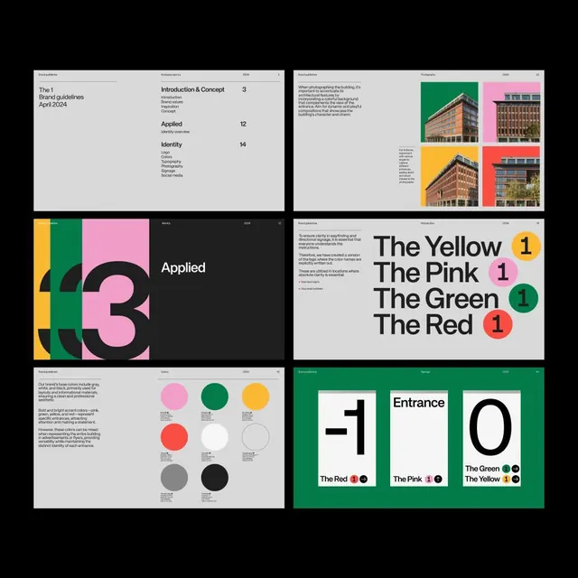
Brand guideline document showing photography usage, identity applied across 12 pages, color system with four core colors, typography, and geometric number mark.
Summary
"The 1" brand guideline showing a four-color palette (pink, green, yellow, red, plus black and grey) applied to architecture photography, a large geometric "3" mark, and tabular color-usage specifications.
Visual description
Six-panel brand guideline spread. Top-left: cover page "The 1 Brand Guidelines April 2024" with table of contents listing Introduction and Concept (page 3), Applied (page 12), and Identity sections. Top-right: four architectural photographs on colored backgrounds (pink, green, yellow, red). Middle-left: large geometric "3" composed of interlocking pink, green, and yellow shapes with black cutouts, labeled "Applied". Middle-right: "Introduction & Concept" text block explaining building photography philosophy. Bottom-left: color grid showing all seven colors (pink, green, yellow, red, black, white, grey) with labels for each. Bottom-right: color-usage chart showing "The Yellow 1", "The Pink 1", "The Green 1", "The Red 1" with numbered badges and usage examples.
Key takeaway
The constraint of exactly four saturated colors (plus black and white) creates instant brand recognition and memorability. Using architecture photography as the primary visual language, not patterns or graphics. The geometric number-mark as a flexible system (can be color-blocked in different combinations). The tabular color-specification page communicates usage clearly.
Reuse notes
Works well for real-estate, architecture, and construction brands where photography is a core asset. The neon-bright colors feel playful but precise, modernizing what could be a stuffy category. The geometric "3" is specific to this brand; the strategy (constrained color palette plus photography) is highly reusable. Ensure adequate contrast when placing colors on photography.
More like this







Keep what you find
A free account saves references to boards and can send you a weekly email of picks based on what you save.
To see every result, go Pro.