
Preview image. Unlock full-res
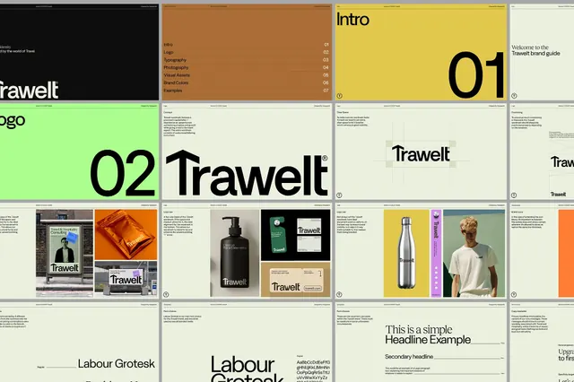
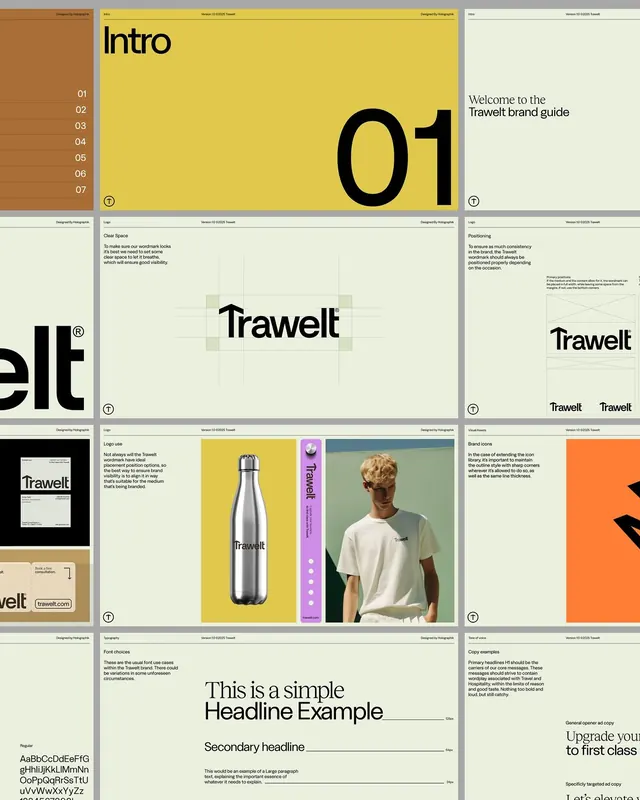
Modular brand guidelines for Trawelt, a travel brand, spanning logo design, color system in mint green and burnt orange, typography, real-world applications, and packaging examples.
Summary
Modular brand guidelines for Trawelt, a travel brand, spanning logo design, color system in mint green and burnt orange, typography, real-world applications, and packaging examples.
Visual description
A multi-panel brand standard layout showing "Trawelt" identity across six components: a dark sidebar introducing the brand narrative and tagline; a burnt-orange reference panel listing sections (Logo, Typography, Photography, Visual Assets, Brand Colors, Examples); a high-contrast mint-green panel featuring the bold oversized "02" numeral and the Trawelt logotype in black sans-serif; a neutral cream panel describing the design approach; and two image panels displaying real-world applications including storefront signage, packaging mockups, and product labeling (a black bottle with mint and cream elements). The design uses a clean sans-serif typeface (Labour Grotesk implied) throughout, prioritizing legibility and structured grid alignment.
Key takeaway
The deliberate color pairing: burnt orange and mint green create warmth and modernity without feeling trendy. The modular presentation of identity rules across conceptual sections and tangible applications shows how guidelines function as both document and toolkit. The restrained, high-contrast layout makes each element memorable and scannable.
Reuse notes
Works well for travel, hospitality, or lifestyle brands aiming for sophistication without coldness. The mint-orange combination skews mid-century modern and appeals to design-forward audiences. The structured grid layout serves as a template for other identity systems. Test the color pair on your own product and audience before committing; it reads upscale but casual.
More like this




Keep what you find
A free account saves references to boards and can send you a weekly email of picks based on what you save.
To see every result, go Pro.