Preview image. Unlock full-res
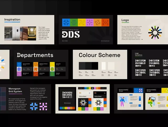
Comprehensive brand system for a design school featuring a modular dot-based logo, departmental color squares, monogram grid, and communication collateral.
Summary
Comprehensive visual identity for an educational institution built on a modular grid system with a central dot-based logo and departmental color assignments.
Visual description
The guideline pages show: top left, an "Inspiration" panel with grid and interior photography on cream background; center, a pixelated dot logo in bright primary colors (blue, green, yellow, magenta, orange) with six color squares and the text "DDS"; top right, a simplified radial sunburst logo in black, blue, yellow, and orange on cream; middle section displays departmental assignments with six colored grid blocks paired with text descriptions (Communication, Mobility/Vehicle, Animation, Bachelors of Design, Interaction, Product); a color-scheme palette with black, cream, light tan, and RGB hex values; bottom left, a monogram grid explanation showing how a 5x5 grid system produces the varied symbol marks using just two filled blocks; bottom right, logo variations and volunteer/communication application examples showing the system in use.
Key takeaway
The idea of a base color palette with departmental sub-assignments that extend one identity into multiple contexts. The transparent grid rationale explaining how constrained geometric rules generate flexible mark variants. The balance between a bold primary symbol and quieter system components that don't fight for attention.
Reuse notes
Strong reference for educational or multi-department organizations needing a system that accommodates different teams or functions without redesigning the logo. Works best when departmental colors have meaning tied to discipline or function. The grid-based mark construction scales well for digital/print/environmental applications.
More like this






Keep what you find
A free account saves references to boards and can send you a weekly email of picks based on what you save.
To see every result, go Pro.