Preview image. Unlock full-res
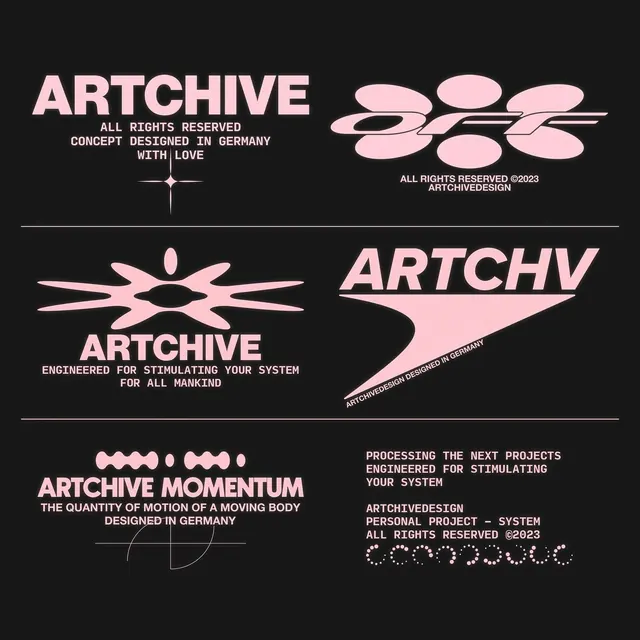
A German design concept using pale pink and black with geometric mark variants, modular symbols, and all-caps sans-serif type to create a technical, archive-focused identity.
Summary
A German design concept using pale pink and black with geometric mark variants, modular symbols, and all-caps sans-serif type to create a technical, archive-focused identity.
Visual description
Four identity variations for "Artchive" arranged on a black background. Top left: blocky headline with credit line and ornamental cross divider. Top right: three overlapping pink ovals forming a horizontal composition, marked with year and designer credit. Bottom left: splayed geometric eye mark in pale pink with "Artchive" below and descriptive tagline in monospace caps. Bottom right: italic logotype with curved underline accent. Horizontal rules divide the specimens. Typography is clean sans-serif in white and pale pink (#FECDD7), all-caps or italic, set tight with deliberate spacing. The palette is starkly minimal: pure black, off-white, and one warm accent pink.
Key takeaway
Modular geometric system using simple shapes (ovals, lines, crosses) that flex across wordmarks, descriptive marks, and ornaments. Pairing monospace and display weights in the same sans-serif to signal engineering precision. High contrast minimal palette (dark ground with single warm accent) that reads as premium and structured.
Reuse notes
Strong reference for technical, systems-driven branding or type-forward identity work. The monospace tagline positioning and geometric mark library work well for architecture, design, or data-adjacent brands. Pair with restrained sans-serif families.
More like this






Keep what you find
A free account saves references to boards and can send you a weekly email of picks based on what you save.
To see every result, go Pro.