Preview image. Unlock full-res
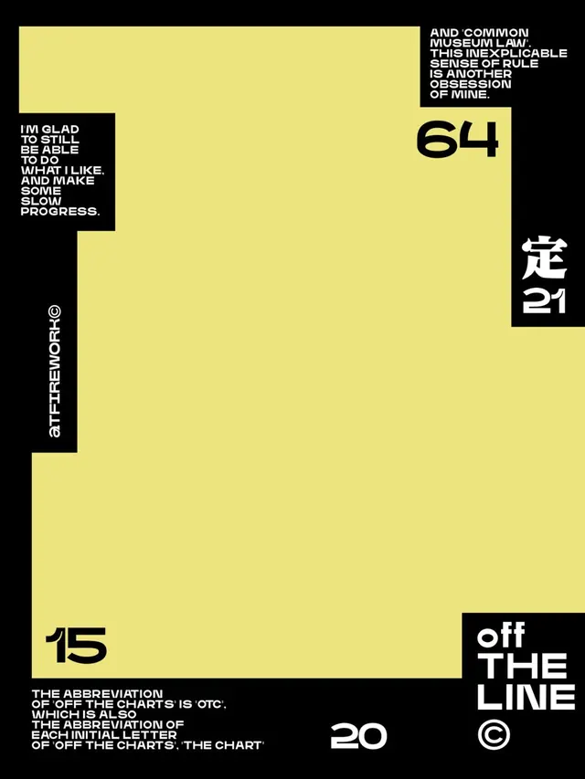
A stark yellow-and-black editorial layout using geometric quadrant blocking, size contrast, and Japanese characters to structure a typography specimen.
Summary
A stark yellow-and-black editorial layout using geometric quadrant blocking, size contrast, and Japanese characters to structure a typography specimen.
Visual description
A vertical rectangle divided into black and cream-yellow quadrants. Black upper-left contains white uppercase text. Upper-right is yellow with a black box holding white text and a stylized Japanese character plus number. A large cream-yellow field dominates the center and lower half, with black text blocks in upper-left and lower portions. Scattered across are numbers (64, 20, 15), quotation marks, Japanese characters, and lowercase paragraph copy. The layout balances dense text passages against expansive negative space. Sans-serif typeface throughout, using weight and scale to establish hierarchy.
Key takeaway
Quadrant blocking organizes disparate content without a rigid grid. Mixing sizes aggressively (small caps to 200pt numerals) creates visual rhythm and guides reading order. The yellow-black pairing is high-impact without color complexity. Negative space breathing room lets small type elements feel intentional rather than cramped.
Reuse notes
Ideal for academic publications, design documentation, or gallery materials where editorial authority matters. The geometric precision reads as expertise. The cream-on-black passages tire eyes on screen; works best in print. Not suitable for consumer or playful brands; the severity alienates casual audiences.
More like this

Keep what you find
A free account saves references to boards and can send you a weekly email of picks based on what you save.
To see every result, go Pro.