Preview image. Unlock full-res
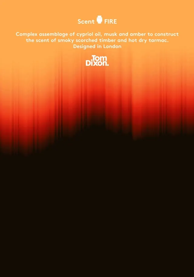
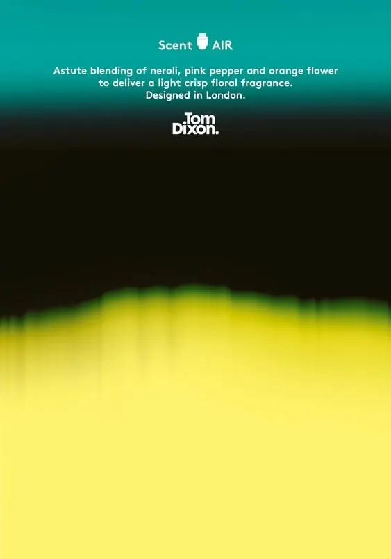
A luxury fragrance brand presentation blending teal and deep black in the top half, anchored by a bold lime-yellow gradient that occupies the lower two-thirds.
Summary
A luxury fragrance brand presentation blending teal and deep black in the top half, anchored by a bold lime-yellow gradient that occupies the lower two-thirds.
Visual description
The composition is vertically divided: top half teal-green background with centered white typography reading "Scent AIR" (product name with small icon) and product descriptor ("Astute blending of neroli, pink pepper and orange flower...") below, with "Bom Dixon" brand mark in white sans-serif. Thin black band separates this from the lower section. Bottom two-thirds is dominated by a large lime-yellow-to-yellow-green gradient that bleeds to the edges, creating a soft glow effect toward the center. The overall effect is luxurious restraint in the type zone contrasted against a bold, energetic color landscape.
Key takeaway
The gradient relegation to the lower section keeps the design's hero moment clear and centered, preventing visual noise in the copy zone. Using complementary colors (lime against teal) in a stacked spatial hierarchy makes the design feel premium rather than chaotic. The soft gradient transition adds sophistication to what could be jarring color separation.
Reuse notes
Strong template for luxury fragrance, cosmetics, or high-end product brands that need a single hero color to signal premium positioning. The teal-lime pairing works well in beauty/wellness sectors. The stacked composition works across digital and print, with the gradient bottom ideal for packaging or large format display. The white typography on teal is highly legible; keep copy density low as shown.