Preview image. Unlock full-res
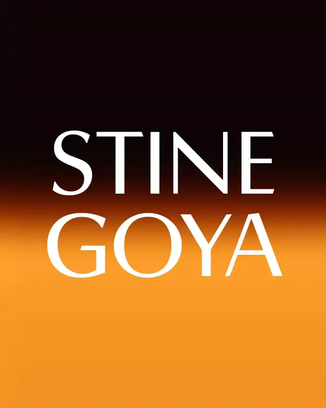
Wordmark for Stine Goya set in large display sans-serif over a vertical black-to-orange gradient background, leveraging color contrast to position the brand as bold and modern.
Summary
Stine Goya wordmark over a bold black-to-orange gradient, emphasizing heat and contemporary luxury through color contrast and clean typography.
Visual description
All-caps wordmark "STINE GOYA" centered on a vertical gradient background shifting from deep charcoal at the top through burnt orange to bright amber at the bottom. The wordmark is set in a geometric, modern sans-serif with generous letterspacing, rendered in bright white for maximum contrast. The gradient itself is the primary design move—soft and unbroken, creating a sense of depth and energy without any additional graphic elements. No decorative marks or supporting text.
Key takeaway
The gradient as a full-frame statement: instead of a static background, the color transition creates motion and emotional warmth that anchors the wordmark. The choice to go all-caps with tight tracking maximizes the impact of the geometric typeface against the gradient. White foreground achieves both readability and elegance when set against a saturated, dark-to-warm gradient.
Reuse notes
Works well for brands in fashion, lifestyle, or creative services that want to project confidence without complexity. The gradient works because it's simple and undirected—avoid mixing it with patterned or photographic elements. Gradient direction (vertical) matters for reading rhythm; test horizontal or diagonal for different moods. Pair with a clean sans-serif that has good contrast at small sizes for secondary applications.
More like this








Keep what you find
A free account saves references to boards and can send you a weekly email of picks based on what you save.
To see every result, go Pro.