Preview image. Unlock full-res
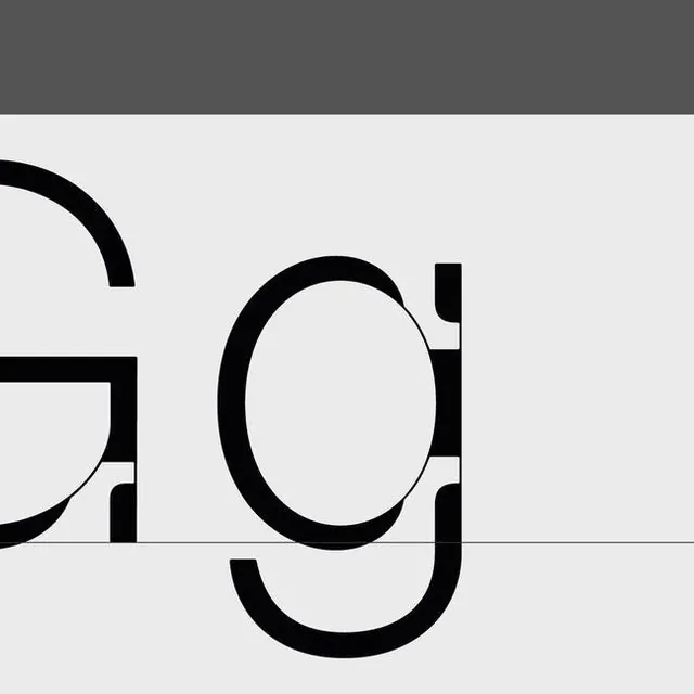
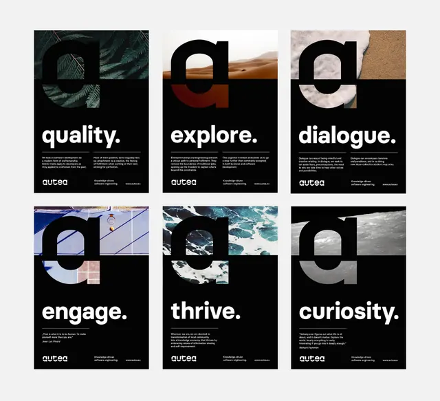
Oversized lowercase letters in heavy geometric sans-serif, anchored by a horizontal line, split across a light gray and charcoal band.

Summary
Partial letterforms displayed at large scale in a geometric sans-serif, bisected by a horizontal line that divides the frame into light and dark zones, creating stark typographic contrast.
Visual description
Close crop of two or three lowercase letters (reading as "g", "o", "u" or similar) rendered in heavy-weight black strokes on a light gray background. A gray header band spans the top of the frame. A single horizontal line cuts through the center, creating visual division between the charcoal top section and the light lower half. The letterforms are bold and angular, using geometric construction with consistent stroke widths, and portions extend into both color zones. Extremely tight framing emphasizes the monumental scale and geometric precision of the type.
Key takeaway
The use of a dividing line as a compositional anchor in a type specimen treatment. Oversizing the type forces viewers to see letterform details and construction: the geometric geometric foundation, the stroke relationships, the negative space within letters. This approach is excellent for showcasing the core DNA of a typeface or identity system without relying on full words or decorative elements.
Reuse notes
Use as a brand identity showcase for corporate, fintech, or b2b companies seeking a rigorous, geometric foundation. The treatment works well in style guides, presentation covers, and collateral to establish hierarchy and visual discipline. The split color treatment also hints at flexible color systems or dual-tone brand applications.
More like this






Keep what you find
A free account saves references to boards and can send you a weekly email of picks based on what you save.
To see every result, go Pro.