Preview image. Unlock full-res
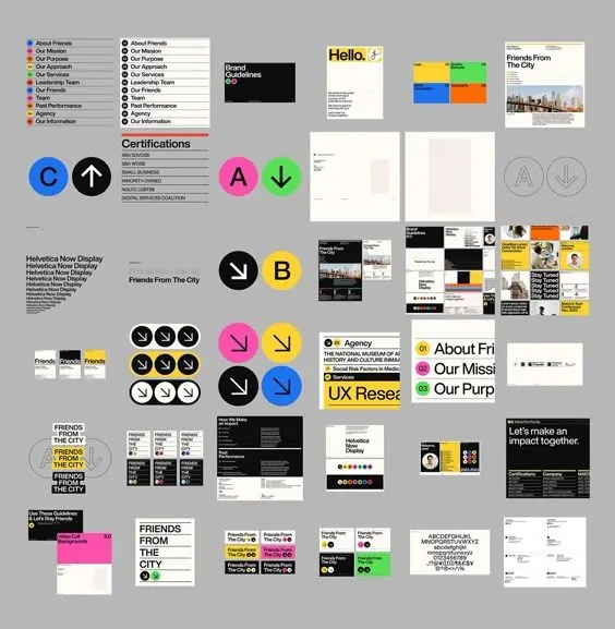
Comprehensive corporate identity system built on a modular circle-and-arrow mark system in black, yellow, and blue, with structured type specimen and application pages.
Summary
A modular corporate identity system centered on a reusable circle-and-directional-arrow mark family in primary colors, demonstrated across type specimens and business application pages.
Visual description
A grid of 25 identity-system pages showing geometric mark variations (blue C, white up-arrow, magenta A, green down-arrow, yellow B) alongside sans-serif type specimen pages, business-card templates, letterhead, website wireframes, and multi-page collateral mockups. The palette is restricted to black, white, and gray, with bright yellow, blue, and magenta as system accents. A strict horizontal-grid layout organizes all pages at uniform scale; sans-serif type runs small and justified in narrow columns, emphasizing technical precision and information density.
Key takeaway
The reusable mark system (same modular diameter, color family, directional variations) that can extend infinitely. The grid discipline that makes diverse page types (type pages, applications, collateral) read as one cohesive system. The restraint of using bright color only in the mark and sidebar, leaving all type and body neutral.
Reuse notes
Strong reference for any modular brand identity relying on geometric marks. Scale well for corporate, tech, consulting, or infrastructure verticals where precision and system rigor matter. The mark density here is high; simpler systems might show fewer variations.
More like this






Keep what you find
A free account saves references to boards and can send you a weekly email of picks based on what you save.
To see every result, go Pro.