Preview image. Unlock full-res
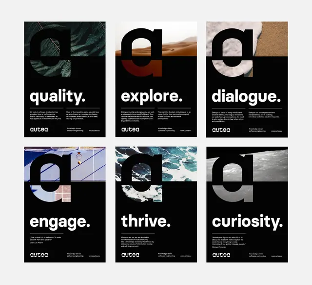
Six-card identity grid pairing single-word concepts (quality, explore, dialogue, engage, thrive, curiosity) with bold geometric shapes and natural photography on alternating black and light backgrounds.
Summary
A six-card system presenting brand values as single-word concepts, each paired with geometric abstraction and texture photography in black-white and light-neutral colorways.
Visual description
Three-by-two grid of rounded-corner cards alternating black and light backgrounds. Each card presents a single white sans-serif word (quality, explore, dialogue, engage, thrive, curiosity) plus a geometric shape (inverted arc, four-pointed form, circular rings, abstract waves, half-circle, fragmented lines) overlaid with or beside a photograph or texture (metallurgy, marble, fabric, organic form). A small white logotype anchors the lower corner. Type is minimal, all-caps, and justified left. Photography and geometric shapes create visual intrigue without explicit imagery. Monocolor palette with earth and concrete tones grounds the system as sophisticated and serious.
Key takeaway
Pairing abstract geometric shapes with photography textures to convey brand values without figurative representation. The alternating black-light grid creates rhythm and forces strong type contrast. Using single words as values, each isolated on its own card, scales easily for different organization sizes or values sets.
Reuse notes
Works best for B2B, corporate, or creative-agency branding where values matter more than product. The black-and-light pattern can feel stark; add a warm neutral (tan, stone) if your brand is softer. Requires quality photography to work; low-res or stock images will cheapen it. Each card can be extracted individually for internal communications, business cards, or web treatments.
More like this







Keep what you find
A free account saves references to boards and can send you a weekly email of picks based on what you save.
To see every result, go Pro.