Preview image. Unlock full-res
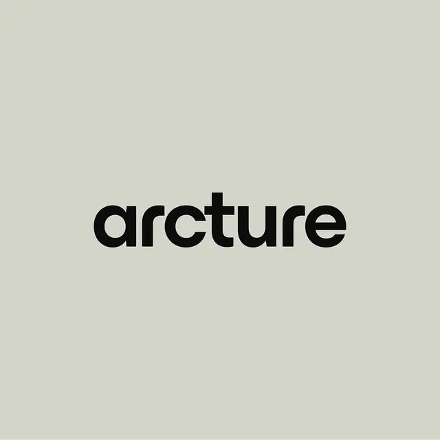
Lowercase sans-serif wordmark 'arcture' in uniform stroke weight black on soft beige, demonstrating geometric refinement.
Summary
A lowercase wordmark setting "arcture" in a geometric sans-serif with consistent stroke weight and spacious letterforms, on soft neutral background.
Visual description
Black lowercase letters spelling "arcture" rendered in a sans-serif face with uniform stem and counter widths, generous spacing between characters, and open circular apertures. The typeface emphasizes geometric clarity through its consistent geometry; each letter feels constructed rather than drawn. The composition is centered on a large field of soft beige-gray background, leaving ample breathing room around the wordmark.
Key takeaway
The pairing of tight vertical spacing with generous letter spacing to create modern, airy elegance; the consistency of stroke weight across all characters for a cohesive, trustworthy feel; the choice to lowercase the entire word as a contemporary, approachable signal.
Reuse notes
Ideal for B2B and technology brands seeking understated sophistication. Works especially well when the audience values precision and clarity over personality. Scales confidently in both digital and print. The generous spacing makes it readable at small sizes and gives it a premium, considered feel.
More like this





Keep what you find
A free account saves references to boards and can send you a weekly email of picks based on what you save.
To see every result, go Pro.