Preview image. Unlock full-res
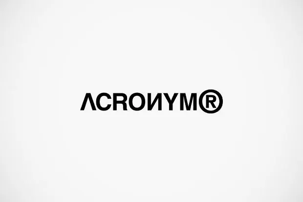
A bold, geometric sans-serif wordmark (ACROIUM) centered on a neutral background with a registered trademark symbol, built for technology or consulting.
Summary
A bold geometric sans-serif wordmark (ACROIUM) with integrated registered trademark symbol, centered on a neutral light gray background, demonstrating restraint and confidence through extreme negative space.
Visual description
A single typographic mark occupies approximately one-fifth of the frame, centered both horizontally and vertically on a light gray background. The wordmark reads "ACROIUM" in a geometric sans-serif face with uniform stroke weight and tight letterspacing, followed immediately by a registered trademark symbol (circle-R) at the same baseline. The letterforms appear to have subtle geometric characteristics (nearly perfect circles and straight lines) typical of contemporary tech-focused typefaces. The overall composition creates a strong asymmetric balance: the type mass on the left, empty space on the right and throughout, emphasizing the wordmark's solidity and authority.
Key takeaway
The restraint of extreme negative space as a confidence signal. The registered mark integrated tightly into the mark as part of the primary lockup (not relegated to small print) suggests immediate legal protection and maturity. The bold weight combined with a geometric typeface reads as both contemporary and serious, suitable for B2B technology.
Reuse notes
Ideal for software, consulting, or developer-tool companies that want to project confidence and technical precision without decoration. Works especially well when the brand needs to occupy small spaces (favicons, social profiles) because the compact letterform and generous surrounding space prevent optical distortion. The monochromatic palette ensures reproduction across materials without variation. Avoid using this approach if the brand needs warmth or approachability; the geometric boldness and negative space can read as cold or corporate without supporting visual warmth elsewhere.
More like this




Keep what you find
A free account saves references to boards and can send you a weekly email of picks based on what you save.
To see every result, go Pro.