Preview image. Unlock full-res
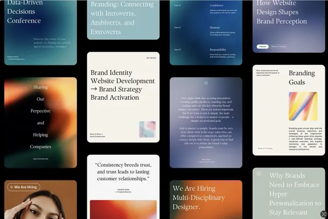
Grid of design agency case study cards showcasing brand strategy work with deep teal, warm orange, and lavender accents over cream backgrounds.
Summary
Grid of stacked case-study cards showcasing brand strategy and digital design work, each with teal, orange, or lavender color blocks and minimal typography layout.
Visual description
A 3-by-4 grid of rectangular cards arranged to show design case-study materials. Each card combines a solid or gradient color block (teal, orange, lavender, or cream) with left-aligned serif and sans-serif typography stating a design discipline: "Brand Identity", "Website Development", "Brand Strategy", "Brand Activation", "Consistency breeds trust", "Branding Goals", "We Are Hiring", and others. Some cards include faint background imagery (photographic faces, abstract shapes). The overall palette consists of deep teal, warm orange, soft lavender, cream, and charcoal gray text. The layout demonstrates a modular card system suitable for presenting agency work and client testimonials.
Key takeaway
The card-grid structure for case-study presentations, using solid color blocking paired with typography rather than heavy imagery. The warm-cool color pairing (teal + orange) creates visual contrast while remaining professional. The minimal serif/sans-serif mixing gives editorial credibility.
Reuse notes
Ideal for design agency portfolios, brand strategy decks, or corporate case-study collections. Works well when you want professional gravitas without heavy photography. The color blocking is flexible and can be adapted to client-specific palettes. Best for B2B contexts where perceived expertise and methodology matter.