Preview image. Unlock full-res
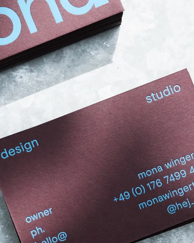
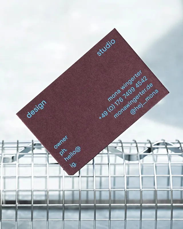
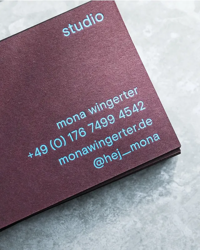
Business card identity using deep burgundy cardstock with cyan sans-serif text for a minimalist, high-contrast design system.
Summary
Designer stationery system using deep burgundy cardstock with bright cyan sans-serif text for contact information, creating a bold chromatic pairing.
Visual description
Layered business cards printed on a matte burgundy (deep wine) stock. Text is rendered in a clean sans-serif in bright cyan blue, printed in two variations. Small vertical text running along the card edge reads "Rockenstrasse 42 9000 St.Gallen" with "Dramatherapie Institut" stacked. The main card face displays "design studio" in cyan, with contact details including "mona winger" as the owner and "dramatherapieinstitut" with phone and email below. A secondary card shows the same layout with "owner ph." and contact information. The composition is shot flat lay against a light grey background with subtle shadow, emphasizing the textural matte finish.
Key takeaway
The complementary-color pairing (deep warm burgundy and cool cyan) is bold yet sophisticated. Rotating the type vertically along the edge adds visual interest without clutter. Matte cardstock + colored ink creates premium tactile impact.
Reuse notes
Ideal for design studios, creative agencies, and portfolios seeking a minimal identity with chromatic punch. The color contrast remains legible in small print and at a distance. Works well for European or culturally-forward brands. The vertical type treatment suits unconventional, design-focused practices.
More like this




Keep what you find
A free account saves references to boards and can send you a weekly email of picks based on what you save.
To see every result, go Pro.