Preview image. Unlock full-res
Brand guidelines document with indigo-to-blue gradient hero section, white body layout, featuring Aeronik typeface and systematic identity approach.
Summary
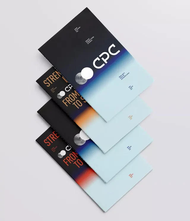
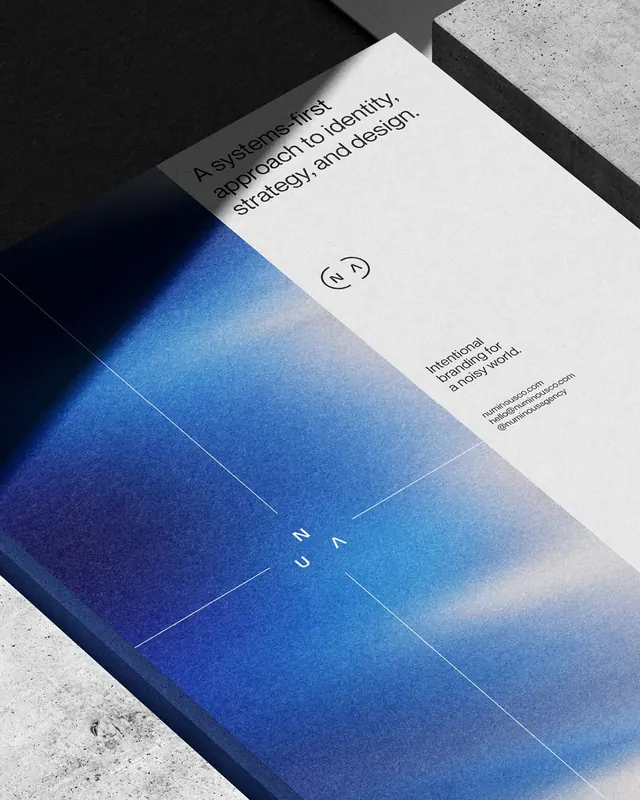
A brand guidelines spread photographed on gray concrete, showing an indigo-to-light-blue gradient hero panel with strategy messaging and a white section featuring the Aeronik typeface specification.
Visual description
A two-panel spread lies at a diagonal angle on textured concrete. The upper panel features a deep indigo background that transitions to a pale blue-white gradient, with centered sans-serif text reading "A systematic approach to identity. Strategy. Digital design." A small circular logo sits top-center. The lower white panel displays "Aeronik Medium" in large, bold sans-serif lettering with a brief body-copy description of the typeface's purpose, explaining its neutral, legible character and suitable applications from headlines to body copy. Small logo and metadata anchors the bottom edge.
Key takeaway
The dramatic gradient transition from dark indigo to light as a visual metaphor for systematic thinking and clarity. The strategy-first messaging position above typeface specification, signaling that brand identity systems begin with strategic intent. The clean two-panel split between conceptual messaging and practical implementation detail.
Reuse notes
Strong template for consulting or strategy-focused brand guidelines presentation. The gradient treatment conveys professionalism and premium positioning without appearing overly trendy. Works especially well when printed or photographed on neutral backgrounds. The layout clearly separates strategic vision (top) from tactical execution (bottom), guiding viewers through the brand philosophy first, then the tools.