Preview image. Unlock full-res
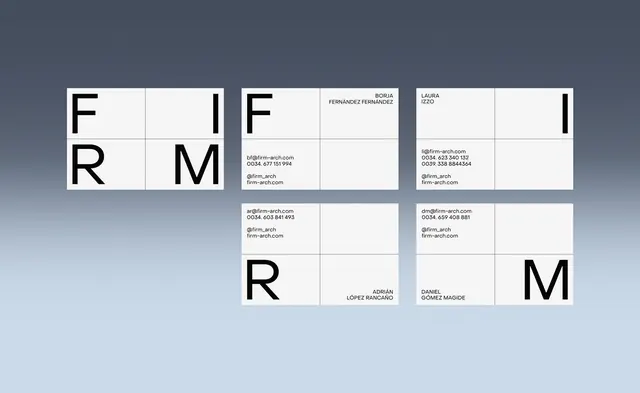
Architectural identity system combining oversized display initials in a rigid grid layout with minimal contact details, printed on white card stock.
Summary
An architectural firm's modular business card system built on a strict grid: three oversized initials (F, I, R, M) paired with scaled contact blocks and staff names, rendered in black sans-serif on white stock.
Visual description
Five white rectangles (landscape business cards) arranged in a cascading grid against a slate background. Each card is divided into four equal quadrants by subtle gridlines. Top-left card shows the F, I, R, M letters stacked diagonally—one character per quadrant, bold sans-serif in black. The adjacent cards (top-center and top-right) contain the firm name FIRM ARCH and different contact details (emails, phone numbers, social handles, website) alongside names (Borja Fernandez Fernandez, Laura Izzo, Adrian Lopez Rancano, Daniel Gomez Magide). Bottom cards repeat the pattern. Generous white space in empty quadrants balances dense typographic blocks.
Key takeaway
The modularity: each card uses the same 2x2 grid, allowing initials and contact info to be shuffled while maintaining visual consistency. The high-contrast letterforms (black on white) photograph cleanly and scale down without losing legibility. Gridlines act as invisible guides that don't require printing; they organize without clutter.
Reuse notes
Perfect for architecture, design, and consulting firms that want to appear structured and meticulous. The system scales: you can add more cards without redesigning. Works equally well digitally (as PDF or online portfolio) or in print. Avoid using colored backgrounds; the impact relies on stark contrast.
More like this








Keep what you find
A free account saves references to boards and can send you a weekly email of picks based on what you save.
To see every result, go Pro.