Preview image. Unlock full-res
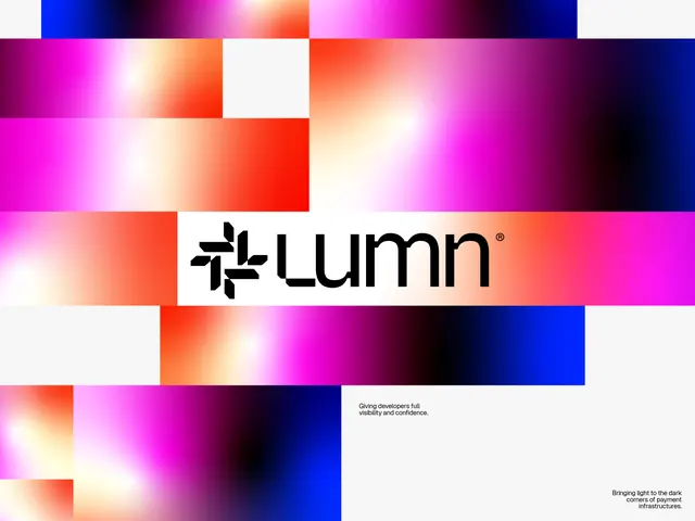
Wordmark logo for Lumn set against a vibrant, abstract gradient composition of overlapping colored rectangles in magenta, red, orange, blue, and white.
Summary
The Lumn wordmark is positioned on a white horizontal band running through an intricate abstract composition of overlapping gradient-filled rectangles. The logo uses a bold, legible sans-serif with a geometric mark preceding the text, signaling a technology or developer-focused brand.
Visual description
Bright, animated gradient rectangles in magenta, coral, red, orange, pink, blue, and white tile the frame in various sizes, each with soft luminous gradients that suggest depth and light. A white horizontal band cuts through the center, holding the black "Lumn" wordmark with a small geometric icon to its left. The tagline "Giving developers full visibility and confidence" appears in small text at lower right, and "Bringing light to the dark corners of payment infrastructures" appears at the bottom right. The geometric rectangles overlap asymmetrically, creating visual energy without chaos. The overall effect is vibrant and modern, balancing structured typography against dynamic, luminous color fields.
Key takeaway
The use of simple rectangular color blocks with smooth luminous gradients to establish a vibrant, energetic backdrop without overwhelming the wordmark. The high-contrast white band as an anchor for legibility. The balance of geometric abstraction with clean, modern sans-serif lettering conveys innovation while remaining professional.
Reuse notes
Effective for tech, SaaS, or developer-tool brands seeking a premium, modern identity rooted in gradient and light effects. Works well when the brand's value proposition involves visibility, clarity, or infrastructure. The white anchor is critical for legibility over complex backgrounds.
More like this




Keep what you find
A free account saves references to boards and can send you a weekly email of picks based on what you save.
To see every result, go Pro.