Preview image. Unlock full-res
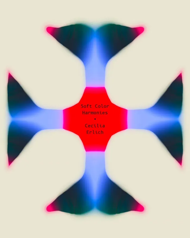
A radially symmetrical brand mark with four quadrants of smooth blue-to-magenta gradients converging on a bright red central hexagon, set on a light beige background.
Summary
A geometric brand mark built on four-way radial symmetry: cool blue-to-teal gradients form the outer petals while bright magenta and cyan bands converge toward a red central hexagon.
Visual description
The composition is strictly symmetrical around a vertical and horizontal centerline. Four identical rounded-rectangle shapes radiate outward from the center, each filled with a smooth gradient flowing from deep navy-teal at the edges to bright cyan-blue toward the center. Between these outer petals, four curved inset regions display gradients from bright magenta outward to teal, creating a secondary petal effect. The central element is a bright red (near pure red) hexagonal shape. Text reading "Soft Color Harmonies" and "Cecilia Erlich" appears in dark serif type at the exact center. The background is a warm cream-beige. The overall effect is fluid and organic despite the geometric construction.
Key takeaway
The four-way symmetry as a structure for building memorable marks. The color harmony: cool blues and cyans grounding a vibrant magenta-red center creates a natural focal point without needing outline strokes. The soft, blurred gradient edges give an animated, modern feel while keeping the mark readable at scale.
Reuse notes
Strong reference for geometric brand marks and logo systems that prioritize symmetry and color harmony. Works well for design studios, creative agencies, or tech-adjacent brands. The saturated central red ensures legibility even when scaled small. Not suitable for monochrome applications.
More like this








Keep what you find
A free account saves references to boards and can send you a weekly email of picks based on what you save.
To see every result, go Pro.