Preview image. Unlock full-res
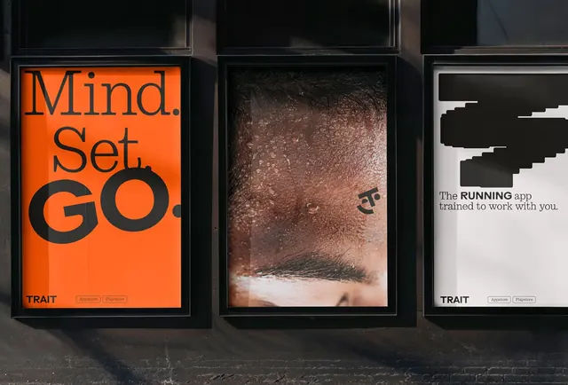
Three framed black posters showing a high-contrast type system: a bold orange sans-serif headline, a textured portrait, and a geometric abstraction with a tech product tagline.
Summary
A three-panel identity system using contrasting visual languages: a bold orange declaration, a warm-toned portrait study, and a crisp black-and-white geometric abstraction, unified by framing and a shared TRAIT label.
Visual description
Three black-framed panels hang in a row on a dark grey weathered wall, shot in daylight. The left panel features "Mind. Set. GO." in a large, condensed orange sans-serif on an orange background, with "TRAIT" in small black type at the bottom. The center panel shows a close-up photograph of textured, sandy-brown material (resembling concrete or earth), creating an organic, tactile surface with a small symbol visible in the corner. The right panel displays clean geometric shapes in white and dark grey on a white background, showing horizontal blocky bars, with text reading "The RUNNING app trained to work with you" and "TRAIT" at the foot. All three panels share the same frame depth and mount height, creating visual continuity despite distinct content.
Key takeaway
The panel-based system allows radically different imagery and treatment within one unified identity: type, photography, and geometric abstraction coexist without competition because the framing and TRAIT branding tie them together. The orange-on-orange declaration reads bold but not loud because of the condensed type choice. The contrast between textured photography and crisp vector geometry suggests depth in product positioning.
Reuse notes
Effective for tech and app brands that need to express multiple facets (inspiration, craft, precision) simultaneously. The three-panel format works well for posters, presentations, or an office installation. The TRAIT label acts as a visual anchor that could scale to more panels. Less suitable for digital-first brands; the physicality and photography anchor it to print and installation contexts.
More like this





Keep what you find
A free account saves references to boards and can send you a weekly email of picks based on what you save.
To see every result, go Pro.