Preview image. Unlock full-res
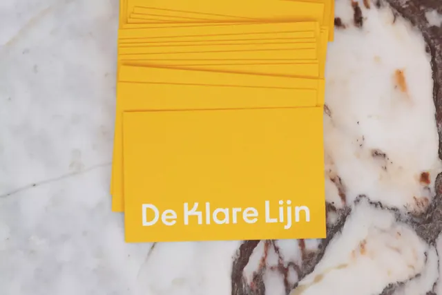
Stack of golden-yellow branded cards with white sans-serif text reading De Klare Lijn, fanned to show depth on a neutral marbled surface.
Summary
Stack of golden-yellow branded cards with white sans-serif text reading De Klare Lijn, fanned to show depth on a neutral marbled surface.
Visual description
Several rectangular business cards in a warm golden-yellow are fanned and overlaid to suggest a stack, creating a subtle sense of dimension. The front-most card displays "De Klare Lijn" in white sans-serif type, centered in the lower half. Fine horizontal grooves score the cards evenly across their face, suggesting high-quality embossing or letterpress detail. The cards rest on a mottled neutral surface with warm cream and cool gray veining, resembling marble or terrazzo. The bright yellow pops sharply against the muted background, emphasizing the clarity and boldness of the branding gesture.
Key takeaway
The use of a single, bold, vibrant color as the entire identity system. The horizontal scoring detail adds tactile interest without competing with the type or color. The marbled background grounds the bright color and suggests a premium production context. Yellow on white is high-contrast and memorable, so text legibility is never an issue.
Reuse notes
Effective for any brand that wants a strong, approachable visual identity. The all-caps sans-serif type is legible even in small sizes. Works well for creative consultancies, design studios, or any business where confidence and clarity are brand values. The embossing detail implies care and craftsmanship; pair with quality card stock for full impact.
More like this

Keep what you find
A free account saves references to boards and can send you a weekly email of picks based on what you save.
To see every result, go Pro.