Preview image. Unlock full-res
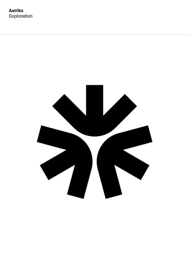
Abstract monochromatic mark composed of geometric shapes, curved and rectangular, arranged to suggest a stylized letter or symbol.
Summary
Pure geometric monochromatic mark built from squared rectangles with curved indentations, a circle, and interlocking shapes suggesting an abstract letter or symbol.
Visual description
Four primary geometric elements compose this mark: a rounded rectangle on the upper left, an inverted curved shape lower left, a perfect circle in the upper center, and a curved-edge rectangle on the right, all in solid black against white. Negative space becomes a design tool, with the negative form of cutouts and curves reading as intentionally as the positive shapes. The entire composition balances horizontal and vertical emphasis while the curved negative spaces introduce visual flow. No text, no color variation, no weight modulation. The symbol is timeless and could function at any scale from favicon to billboard.
Key takeaway
The principle that a letterform or mark does not need to resemble actual letters to function as an identity mark. The use of primary geometric primitives (rectangle, circle, curve) and their negative spaces equally. The complete absence of decorative intent, where every mark is load-bearing. The reliance on pure contrast and clean geometry to convey authority and professionalism without type or imagery.
Reuse notes
Best for brands seeking a symbol that is culturally neutral and works across all contexts (tech, finance, consulting, nonprofits). The abstraction means it reads as timeless and avoids trends. However, the symbol carries zero narrative; pair it with clear type and a defined brand voice elsewhere. Works equally in single-color, reversed, or solid fill without losing legibility.