Preview image. Unlock full-res
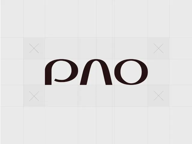
Dark chocolate monoline wordmark spelling 'pno' in three lowercase letters with rounded terminals, centered on a light grid background.
Summary
Dark chocolate monoline wordmark spelling 'pno' in three lowercase letters with rounded terminals, centered on a light grid background.
Visual description
Three lowercase letters rendered in a monoline sans-serif typeface with gently rounded terminals. The dark brown stroke color (#210C0E) achieves high contrast against the pale gray background. Letters sit in perfect horizontal alignment on a subtle grid overlay with light gray grid lines and centered reference marks (small x marks) above and below. Consistent stroke weight throughout, achieving a refined, geometric appearance. The composition is perfectly symmetrical and centered, with ample breathing room on all sides.
Key takeaway
The monoline discipline: equal stroke weight across all forms creates an elegant, modern wordmark without weight variation. The rounded terminals humanize the geometry while maintaining technical precision. Grid-based composition grounds the design in systematic proportion, ideal for brand systems where precision matters.
Reuse notes
Strong reference for tech, design, or luxury brands needing a refined wordmark. The monoline construction reads well at small sizes and works equally in single color or reversed. Best paired with spacious layouts that respect its centered composition.