Preview image. Unlock full-res
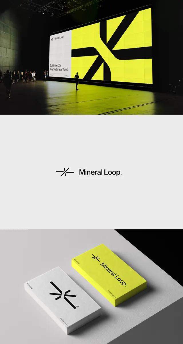
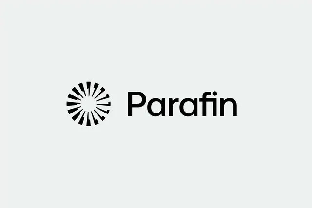
A horizontal lockup pairing a minimalist circular starburst mark with a bold geometric sans-serif wordmark on a light neutral ground.
Summary
A horizontal logo lockup with a radial starburst mark on the left aligned with an uppercase sans-serif wordmark on a light neutral ground.
Visual description
The composition is a left-to-right horizontal pairing. The mark is a circle made of thick radiating black wedges (approximately 16 wedges) that suggest motion, energy, or precision. The wedges are solid black with white negative space between them. The wordmark "Parafin" sits to the right in bold, geometric sans-serif type with even letterforms, rendering in all lowercase except the initial capital P. The baseline alignment between mark and wordmark is clean and geometric. The overall palette is pure black on a light gray-white background with generous white space around both elements.
Key takeaway
The starburst mark reads as both motion and precision, appropriate for pharmaceutical, tech, or energy industries; the horizontal lockup is scalable and works equally well at full width or stacked; the weight and proportional relationship between mark and wordmark creates a unified visual system where neither dominates.
Reuse notes
Effective for brands in healthcare, industrial, or technology sectors that need to signal trust and modernity simultaneously. The starburst vocabulary pairs well with clean sans-serif systems and minimal color palettes. Works well in monochrome applications and scales effectively for embroidery, screen print, or signage. Less suited to ornate or illustrative brand systems.