Preview image. Unlock full-res
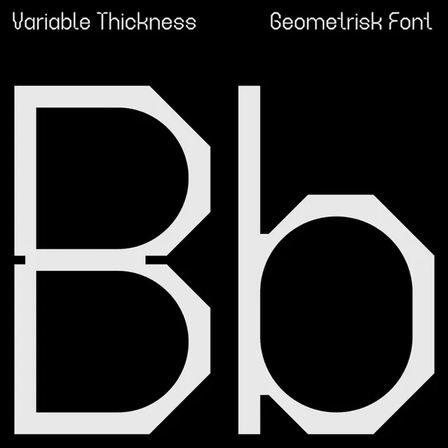
A typeface sample displaying a single-weight sans-serif with variable stroke width and sharp geometric joins, shown as capital letterforms against black.
Summary
A typeface sample displaying a single-weight sans-serif with variable stroke width and sharp geometric joins, shown as capital letterforms against black.
Visual description
Two capital letters (D and b) are shown at large scale against a pure black background, with white space filling the counter forms. The typeface exhibits a characteristic tapered design where horizontal strokes are thinner than vertical strokes, and the corners are sharp and angular rather than rounded. The geometric joins are clean and precise. The small label "Variable Thickness" and "Geometrisk Font" appear at the top in a lighter sans-serif weight, providing type hierarchy and context.
Key takeaway
The variable-width approach within a single weight (contrast without needing multiple styles); the way sharp joints create a modern, technical feeling; using negative space to show letterform structure clearly.
Reuse notes
Excellent reference for headline and display typography systems, especially for tech or precision-focused brands. The narrow strokes can reduce legibility at small sizes, so best deployed for large signage, branding, or poster use.
More like this






Keep what you find
A free account saves references to boards and can send you a weekly email of picks based on what you save.
To see every result, go Pro.