Preview image. Unlock full-res
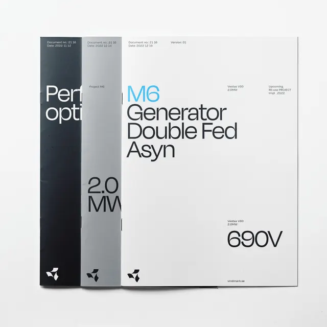
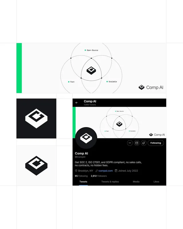
Four-pointed star logo and brand collateral for a solar-technology company using blueprint-style layouts and monochromatic blue-on-black palette.
Summary
A four-pointed star mark anchors the Taylor solar brand, displayed across product photography, technical documentation, and minimalist collateral in a cool blue and silver palette.
Visual description
The composition shows three distinct applications of the Taylor brand across a neutral gray background. Left panel: white background with "taylor." in light blue, the four-pointed star in blue, and a black product image below labeled "taylor solar". Center panel: charcoal background with "more power." in white type and an inverted white four-pointed star. Right panel: bright royal-blue panel with "taylor." in white, an ID number "T-01", and the white star outline, sitting atop a product photograph of solar hardware. The star is geometrically precise with concave indents on each point. Typography is clean, lowercase sans-serif in a light weight. The overall system uses stark contrast between dark and light grounds to showcase the mark and emphasize technical sophistication.
Key takeaway
The four-pointed concave star is distinctive and works at any scale. The monochromatic blue on white/black approach feels both premium and industrially credible. Pairing minimalist type with product photography grounds the abstract mark in tangible hardware.
Reuse notes
Effective for cleantech, hardware, and engineering-forward companies. The star's concave geometry reads as engineered, not decorative. Works best with generous negative space and strong typographic hierarchy. The blueprint quality suits product-centric brands more than service-first companies.