Preview image. Unlock full-res
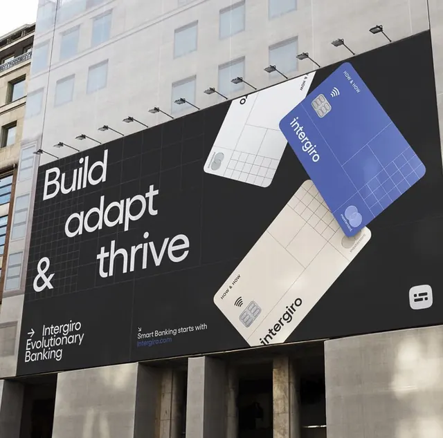
A street billboard for Intergiro banking showcasing two payment cards in angled perspective against a black background with white sans-serif headline and tagline.
Summary
A street billboard for the fintech brand Intergiro featuring two angled payment cards (one blue, one neutral) against a bold black background with white geometric typography.
Visual description
The composition splits into two visual zones: a large street-side building backdrop on the left serving as negative space context, and a dominant diagonal arrangement of two isometric payment cards on the right. The blue card (Intergiro branded) and white card (with grid pattern and contactless icon) overlap and tilt forward to suggest movement. The headline "Build adapt & thrive" sits left-aligned in large white sans-serif, with the Intergiro descriptor and website URL below. A ceiling-hung lighting rig is visible above the cards, emphasizing the 3D depth. The color palette is restrained: black background, white type, cool blue accent on the primary card, and subtle gray-brown tones on the secondary card. The overall feel is modern fintech vernacular.
Key takeaway
The isometric card arrangement creates believable product perspective without a photo-real render. Angling two similar elements at complementary angles signals motion or transition (perfect for a "adapt & thrive" narrative). The restraint of the black background lets the cards and type dominate without illustration clutter.
Reuse notes
Effective for financial-services or payment-product billboard/outdoor work. The angled isometric approach works well when you need to show two product variants or states in one frame. Works best paired with a simple, declarative headline rather than descriptive copy.
More like this








Keep what you find
A free account saves references to boards and can send you a weekly email of picks based on what you save.
To see every result, go Pro.